# Flowbite Svelte Documentation - Full Context
# Generated on 2025-09-03T12:48:59.651Z
# This file contains all documentation concatenated in logical order
# ===== PAGES =====
# AI and LLM Integration with Flowbite Svelte
Flowbite Svelte provides powerful, built-in support for AI and Large Language Model (LLM) integration through specialized routes that expose documentation in machine-readable formats. These features enable seamless integration with ChatGPT, Claude, and other AI assistants.
## Compliance
Flowbite Svelte follows the [llms.txt standard](https://llmstxt.org/), a community-driven proposal initiated by Jeremy Howard that standardizes how websites provide LLM-friendly information.
Our implementation helps address the fundamental challenge that language models face: context windows are too small to process entire websites, and HTML content with navigation, ads, and JavaScript is difficult to convert to LLM-friendly formats.
By adopting this standard, Flowbite Svelte ensures that AI assistants can efficiently access our documentation without struggling with complex HTML or excessive content.
## Machine-Readable Routes
### llms.txt
The `llms.txt` file is a **manifest** that tells large language models (LLMs) where to find your AI-friendly Markdown documentation.
It works like a `robots.txt` or `sitemap.xml`, but is specifically designed for LLMs to efficiently discover and consume your docs.
You can access it at [https://flowbite-svelte.com/llms.txt](https://flowbite-svelte.com/llms.txt).
### context-full.txt
The `context-full.txt` file is a **complete bundle** of all your documentation, combined into one large text file.
It includes full explanations, code examples, and details, making it ideal for LLMs with large context windows.
You can access the full text at [https://flowbite-svelte.com/llm/context-full.txt](https://flowbite-svelte.com/llm/context-full.txt).
### Markdown API Access
All documentation pages can be accessed in pure markdown format by simply replacing `docs` with `llm` and appending `.md` to their URLs. For example:
- [https://flowbite-svelte.com/llm/pages/introduction.md](https://flowbite-svelte.com/llm/pages/introduction.md)
- [https://flowbite-svelte.com/llm/components/buttons.md](https://flowbite-svelte.com/llm/components/buttons.md)
- [https://flowbite-svelte.com/llm/extend/progressradial.md](https://flowbite-svelte.com/llm/extend/progressradial.md)
## Implementation Examples
Here's how you might leverage these features in your AI integration:
```ts
// Accessing component documentation in markdown format
const buttonDocs = await fetch("https://flowbite-svelte.com/docs/components/buttons.md").then((res) => res.text());
// Using markdown documentation in a ChatGPT prompt
const chatGptPrompt = `Based on this Flowbite Svelte Button component documentation:
${buttonDocs}
Generate a code example for a primary button with a link to '/about'.`;
```
These features make it easy to integrate Flowbite Svelte's documentation with modern AI systems, creating powerful, intelligent tools to enhance developer experience and productivity.
## LLM Link
---
# Colors - Flowbite Svelte
## Primary and secondary colors
In the provided code, you can customize the primary and secondary color by modifying the appropriate color values.
```css
@import "tailwindcss";
@plugin 'flowbite/plugin';
@custom-variant dark (&:where(.dark, .dark *));
@theme {
--color-primary-50: #fff5f2;
--color-primary-100: #fff1ee;
--color-primary-200: #ffe4de;
--color-primary-300: #ffd5cc;
--color-primary-400: #ffbcad;
--color-primary-500: #fe795d;
--color-primary-600: #ef562f;
--color-primary-700: #eb4f27;
--color-primary-800: #cc4522;
--color-primary-900: #a5371b;
--color-secondary-50: #f0f9ff;
--color-secondary-100: #e0f2fe;
--color-secondary-200: #bae6fd;
--color-secondary-300: #7dd3fc;
--color-secondary-400: #38bdf8;
--color-secondary-500: #0ea5e9;
--color-secondary-600: #0284c7;
--color-secondary-700: #0369a1;
--color-secondary-800: #075985;
--color-secondary-900: #0c4a6e;
}
@source "../node_modules/flowbite-svelte/dist";
@source "../node_modules/flowbite-svelte-icons/dist";
```
## Examples
```svelte
Secondary
Noteworthy technology acquisitions 2021
Here are the biggest enterprise technology acquisitions of 2021 so far, in reverse chronological order.
FlowbiteHomeAboutServicesPricingContact
{#snippet icon()}
{/snippet}
Dismissable user notification.
```
## LLM Link
---
# Compiler Speed - Flowbite Svelte
If your Svelte app only requires a few components, it's recommended that you import them directly. Doing so can help optimize compilation speed and improve performance by reducing the amount of code that needs to be processed during compilation.
```js
import Alert from "flowbite-svelte/Alert.svelte";
```
## Speed comparisons
The above table shows examples from using `import Alert from 'flowbite-svelte/Alert.svelte'`. Compare these numbers to the following table where using normal import.
## LLM Link
---
# Customization - Flowbite Svelte
When working with components, you may want to customize their default or specific classes. Here's a guide on how to achieve that. Starting from version 0.38.0, we have transitioned from using classnames to tailwind-merge, which allows us to easily overwrite classes and avoid style conflicts. This update brings enhanced flexibility and simplifies the process of customizing component styles.
## Understanding Props
Each component has a props section where you can find information on how to customize classes. For example, let's refer to the [Alert component data section](https://next.flowbite-svelte.com/docs/components/alert#component-data).
In this case, you can overwrite the outer div class by adding the `class` prop. Here's an example:
```svelte
Add a class to overwrite the default class!
```
Thanks to tailwind-merge, you can efficiently merge Tailwind CSS classes without style conflicts. One of its features is that the last conflicting class wins. Please read more details about [Merging behavior](https://github.com/dcastil/tailwind-merge/blob/v1.13.1/docs/features.md)
## Importance of ! for Some Components
In Tailwind CSS, you can make any utility class important by adding a `!` character at the beginning of the class name. Certain components may require this approach to successfully overwrite styles. Here's an example:
```svelte
```
## Overwriting Specific Classes
While the `class` prop can be used for most components, some components with a complex structure may require multiple props.
For instance, let's consider [the Banner component](https://next.flowbite-svelte.com/docs/components/banner#component-data) has two relevant props: `class` for `div` and `classInner` for `innerClass`. To overwrite the `div`, you can use the `classDiv` prop:
```svelte
Overwriting divClass and innerClass
```
You can observe the background color change to green.
### New way of customization
Instead of intrducing multiple props for component's internal element classes new prop `classes` has been introduced: an object of internal element names and desired new classes. The above example will therefore change to:
```svelte
Overwriting divClass and innerClass
```
The `classes` prop becomes the default way of customization and the multiple props mentioned above are marked as deprecated.
We hope these instructions help you confidently customize component classes. Feel free to reach out if you have any further questions!
## Global customization
To customize the flowbite-svelte component globally, follow these steps:
Start by creating your own component based on flowbite-svelte.
Create a new file for your button component in the lib directory:
```svelte
```
Once you have created your button component, you can use it in your project.
In your project, import your custom button component:
```js
```
Use the custom button component in your project by adding the following code:
```html
My New Button
```
With these steps, you can customize and use your own button component globally based on flowbite-svelte. Feel free to modify the styles and properties of the component according to your requirements.
## LLM Link
---
# FAQ and Tips - Flowbite Svelte
## Svelte key blocks
Svelte key blocks destroy and recreate their contents when the value of an expression changes. This can be useful when you are using SvelteKit (group) routing.
For example, if you have a following group routing:
```
├── (app)
│ ├── +layout.svelte
│ ├── +page.svelte
│ ├── about
│ │ └── +page.svelte
│ ├── contact
│ │ └── +page.svelte
│ ├── orders
│ │ └── +page.svelte
│ └── profile
│ └── +page.svelte
└── +layout.svelte
```
The following example shows how to add navigation using the key blocks:
```svelte
// src/routes/(app)/+layout.svelte
{#key activeUrl}
HomeAboutContactOrdersProfile
{/key}
{@render children()}
```
## My compiled CSS size is more than 120K. How can I make it smaller?
First build the current setting and check the CSS size.
```sh
pnpm build
```
Then run the following command to see your compiled CSS sizes.
```sh
find .svelte-kit/output/client/_app/immutable -type f -name "*.css" -exec du -h {} +
```
To purge the CSS files, you can use `vite-plugin-tailwind-purgecss`.
### Installation
```sh
pnpm i -D vite-plugin-tailwind-purgecss
```
### vite.config.ts
```js
import { sveltekit } from "@sveltejs/kit/vite";
import { defineConfig } from "vitest/config";
import { purgeCss } from "vite-plugin-tailwind-purgecss";
export default defineConfig({
plugins: [sveltekit(), purgeCss()],
test: {
include: ["src/**/*.{test,spec}.{js,ts}"]
}
});
```
Run `pnpm build` and run the same command to see the compiled CSS size.
```sh
find .svelte-kit/output/client/_app/immutable -type f -name "*.css" -exec du -h {} +
```
## LLM Link
---
# How to Contribute - Flowbite Svelte
Here are some guidelines we'd like you to follow before submitting a PR.
## Create a fork
- Create a fork from [flowbite-svelte](https://github.com/themesberg/flowbite-svelte) to your repository first.
- Change `.env.example` file name to `.env`.
- Run `pnpm build and pnpm check`.
## Please use pnpm to install
The repo uses `pnpm`, so using `pnpm` is desirable when you fork and install dependencies to avoid unseen problems.
When there is a change in `package.json`, remove `pnpm-lock.yml` and `node_modules` directory and run `pnpm i`.
## Tailwind CSS
[Tailwind warns](https://tailwindcss.com/docs/content-configuration#dynamic-class-names) that you don't construct class names dynamically. Instead of this:
```html
```
Always use complete class names:
```html
```
## Types and Props
Please run the following to update prop files.
```sh
pnpm svelte-helpers
```
This command is to generate component documentation for all Svelte files within the src/lib directory and generate JSON files containing props information from all Svelte files in the src/lib directory, placing them in the routes/component-data directory.
## Format and check
Please run the following to format the code.
```sh
pnpm format && pnpm check
```
## Conventional commit
When making a commit, we recommend using [the Conventional commits](https://www.conventionalcommits.org/en/v1.0.0/).
Some examples are:
```sh
feat: add rating component
fix: add if statement to Button component
chore: clean up About page
docs: add timeline page
style: update home page
test: add modal test
```
Use `!` for a minor bump.
```sh
feat!: add drawer component and page
```
When you have a breaking change:
```sh
git commit -a "feat: change btnClass name to bClass" -m "BREAKING CHANGE: change the Button component attributes"
```
## Playwright Test
Before submitting a PR, please run a test:
```sh
pnpm test:e2e
```
If you want to run an single test file, `tests/typography.spec.ts`:
```sh
npx playwright test tests/typography.spec.ts
```
## A11y Test
We recommend to test a page with [Nu Html Checker](https://validator.unl.edu/) relating to your change.
Test a page.
```sh
axe http://localhost:3000/dropdowns/image
```
## LLM Link
---
# IDE Support - Flowbite Svelte
## IDE support
If you are using an LSP-compatible editor, such as VSCode, Atom, Sublime Text, or Neovim, hovering over a component name will display a documentation link, type link, and props information.
## LLM Link
---
# Flowbite Svelte - UI Component Library
[Flowbite Svelte](https://github.com/themesberg/flowbite-svelte) is a free and open-source UI component library based on the core Flowbite components and built with native Svelte components and interactivity handling.
This library features hundreds of interactive elements such as navbars, dropdowns, modals, and sidebars all handled by Svelte and based on the utility classes from Tailwind CSS.
## Getting started
Learn how to get started with Flowbite Svelte by following the quickstart guide and start leveraging the interactive Svelte components coupled with Flowbite and Tailwind CSS.
### Using SvelteKit
You can install SvelteKit or Svelte to start your app. For SvelteKit:
```bash example
// install tailwindcss as well
npx sv create my-app
cd my-app
pnpm install
```
### Using Svelte
If you want to get started with Svelte:
```bash
npm create vite@latest myapp -- --template svelte
cd myapp
pnpm install
```
#### Install Tailwind CSS
If your svelte project doesn't have `tailwindcss` installed, install it using NPM:
```bash
npx sv add tailwindcss
pnpm install
```
Run a local development server by running:
```bash
pnpm dev
```
### Install Flowbite Svelte
Run the following command to install all Flowbite dependencies and libraries:
```sh
pnpm i -D flowbite-svelte flowbite
```
### Optional
Install `flowbite-svelte-icons` for the examples to work properly:
```sh
pnpm i -D flowbite-svelte-icons
```
### Configuration
Update your main `css` file to support Tailwindcss and Flowbite plugin. You can as well customize the primary color by modifying the appropriate color values.
If you use SvelteKit the main css file is `src/app.css`.
```css
@import "tailwindcss";
@plugin 'flowbite/plugin';
@custom-variant dark (&:where(.dark, .dark *));
@theme {
--color-primary-50: #fff5f2;
--color-primary-100: #fff1ee;
--color-primary-200: #ffe4de;
--color-primary-300: #ffd5cc;
--color-primary-400: #ffbcad;
--color-primary-500: #fe795d;
--color-primary-600: #ef562f;
--color-primary-700: #eb4f27;
--color-primary-800: #cc4522;
--color-primary-900: #a5371b;
--color-secondary-50: #f0f9ff;
--color-secondary-100: #e0f2fe;
--color-secondary-200: #bae6fd;
--color-secondary-300: #7dd3fc;
--color-secondary-400: #38bdf8;
--color-secondary-500: #0ea5e9;
--color-secondary-600: #0284c7;
--color-secondary-700: #0369a1;
--color-secondary-800: #075985;
--color-secondary-900: #0c4a6e;
}
@source "../node_modules/flowbite-svelte/dist";
@source "../node_modules/flowbite-svelte-icons/dist";
@layer base {
/* disable chrome cancel button */
input[type="search"]::-webkit-search-cancel-button {
display: none;
}
}
```
Now you should be able to work with the Flowbite Svelte library and import components such as the navbar, dropdown, modal, and more.
## Svelte
Svelte is a modern and growing front-end compiler. Developers build boilerplate-free components using languages HTML, CSS and JavaScript. Svelte compiles your code to tiny, framework-less vanilla JS.
## Tailwind CSS
Flowbite Svelte leverages the utility classes from the popular [Tailwind CSS](https://tailwindcss.com) framework allowing greater customization capabilities directly from a component level in Svelte.
## Flowbite Ecosystem
[Flowbite](https://flowbite.com) is also available in other frameworks such as vanilla JS with HTML, React, Vue, Angular, and even integration possibilities with back-end frameworks such as Laravel, Django, Flask, and Phoenix.
Check out the main [GitHub repository](https://github.com/themesberg/flowbite) to explore other libraries too as well as the [Figma design system](https://flowbite.com/figma/).
## UI Components
Flowbite Svelte has a rich collection of commonly used components coded with Svelte that leverage the utility classes from Tailwind CSS and you can check out the full list of components by navigating through the components section in the sidebar on the left side of the page.
## Contributing
Flowbite Svelte is a free and open-source UI component library built with Svelte native components and based on the Flowbite ecosystem and contributions are more than welcome.
Check out [contributing guide](/docs/pages/how-to-contribute) to learn how you can be a part of the open-source community.
## License
Flowbite Svelte is a free and open-source UI component library licensed under the [MIT License](https://github.com/themesberg/flowbite-svelte/blob/main/LICENSE).
## LLM Link
---
# License - Flowbite Svelte
## MIT License
#### Copyright (c) 2022 Flowbite Svelte
Permission is hereby granted, free of charge, to any person obtaining a copy of this software and associated documentation files (the "Software"), to deal in the Software without restriction, including without limitation the rights to use, copy, modify, merge, publish, distribute, sublicense, and/or sell copies of the Software, and to permit persons to whom the Software is furnished to do so, subject to the following conditions:
The above copyright notice and this permission notice shall be included in all copies or substantial portions of the Software.
THE SOFTWARE IS PROVIDED "AS IS", WITHOUT WARRANTY OF ANY KIND, EXPRESS OR IMPLIED, INCLUDING BUT NOT LIMITED TO THE WARRANTIES OF MERCHANTABILITY, FITNESS FOR A PARTICULAR PURPOSE AND NONINFRINGEMENT. IN NO EVENT SHALL THE AUTHORS OR COPYRIGHT HOLDERS BE LIABLE FOR ANY CLAIM, DAMAGES OR OTHER LIABILITY, WHETHER IN AN ACTION OF CONTRACT, TORT OR OTHERWISE, ARISING FROM, OUT OF OR IN CONNECTION WITH THE SOFTWARE OR THE USE OR OTHER DEALINGS IN THE SOFTWARE.
## LLM Link
---
# Quickstart - Flowbite Svelte
You can install Flowbite Svelte by using the flowbite-svelte-start or from scratch.
## Getting started
Learn how to get started with Flowbite Svelte by following the quickstart guide and start leveraging the interactive Svelte components coupled with Flowbite and Tailwind CSS.
### Using SvelteKit
You can install SvelteKit or Svelte to start your app. For SvelteKit:
```bash example
// install tailwindcss also
npx sv create my-app
cd my-app
pnpm install
```
### Using Svelte
If you want to get started with Svelte:
```bash
npm create vite@latest myapp -- --template svelte
cd myapp
pnpm install
```
#### Install Tailwind CSS
If your svelte project doesn't have `tailwindcss` installed, install it using NPM:
```bash
npx sv add tailwindcss
pnpm install
```
Run a local development server by running:
```bash
pnpm dev
```
### Install Flowbite Svelte
Run the following command to install all Flowbite dependencies and libraries:
```sh
pnpm i -D flowbite-svelte flowbite
```
### Optional
Install `flowbite-svelte-icons` for the examples to work properly:
```sh
pnpm i -D flowbite-svelte-icons
```
### Configuration
Update your main `css` file to support Tailwindcss and Flowbite plugin. You can as well customize the primary color by modifying the appropriate color values.
If you use SvelteKit the main css file is `src/app.css`.
```css
@import "tailwindcss";
@plugin 'flowbite/plugin';
@custom-variant dark (&:where(.dark, .dark *));
@theme {
--color-primary-50: #fff5f2;
--color-primary-100: #fff1ee;
--color-primary-200: #ffe4de;
--color-primary-300: #ffd5cc;
--color-primary-400: #ffbcad;
--color-primary-500: #fe795d;
--color-primary-600: #ef562f;
--color-primary-700: #eb4f27;
--color-primary-800: #cc4522;
--color-primary-900: #a5371b;
--color-secondary-50: #f0f9ff;
--color-secondary-100: #e0f2fe;
--color-secondary-200: #bae6fd;
--color-secondary-300: #7dd3fc;
--color-secondary-400: #38bdf8;
--color-secondary-500: #0ea5e9;
--color-secondary-600: #0284c7;
--color-secondary-700: #0369a1;
--color-secondary-800: #075985;
--color-secondary-900: #0c4a6e;
}
@source "../node_modules/flowbite-svelte/dist";
@source "../node_modules/flowbite-svelte-icons/dist";
@layer base {
/* disable chrome cancel button */
input[type="search"]::-webkit-search-cancel-button {
display: none;
}
}
```
Now you should be able to work with the Flowbite Svelte library and import components such as the navbar, dropdown, modal, and more.
Now you are ready to go! Add the following to `src/routes/+page.svelte` and if you see the following image, then your setting is complete.
```svelte
Info alert!
Change a few things up and try submitting again.
```
## Starters
You can use one of starter repo for a quick start.
## LLM Link
---
# ThemeProvider - Flowbite Svelte
## Basic Usage
Wrap your components with ThemeProvider and pass a theme configuration object:
```svelte
Noteworthy technology
Here are the biggest enterprise technology acquisitions of 2021 so far, in reverse chronological order.
```
## Theme Configuration
The theme configuration object allows you to customize individual components. Each component key corresponds to a Flowbite-Svelte component, and the value defines the styling overrides.
## Component Theme Structure
Different components have different theme structures. Here are some examples:
### Simple String Themes
Some components accept a simple string for their theme:
```js
const theme = {
accordion: "w-96 text-green-500",
alert: "bg-green-500 text-white",
avatar: "bg-blue-50 text-green-700"
};
```
### Object-Based Themes
More complex components use object-based themes with multiple properties:
```js
const theme = {
button: {
base: "w-48",
outline: "border-2 border-purple-500",
shadow: "shadow-lg"
},
card: {
base: "bg-red-50 w-72",
image: "rounded-t-lg"
},
badge: {
base: "bg-purple-400 text-white"
}
};
```
## Naming Convention
The ThemeProvider follows a consistent naming convention for theme objects and types:
### Theme Object Names
Theme object names use the component name with the first letter in lowercase:
```md
Accordion.svelte → accordion
AccordionItem.svelte → accordionItem
BottomNav.svelte → bottomNav
BottomNavItem.svelte → bottomNavItem
BreadcrumbItem.svelte → breadcrumbItem
ButtonGroup.svelte → buttonGroup
GradientButton.svelte → gradientButton
```
### Type Names
Type names use the component name followed by "Theme":
```md
Accordion.svelte → AccordionTheme
AccordionItem.svelte → AccordionItemTheme
BottomNav.svelte → BottomNavTheme
BottomNavItem.svelte → BottomNavItemTheme
BreadcrumbItem.svelte → BreadcrumbItemTheme
ButtonGroup.svelte → ButtonGroupTheme
GradientButton.svelte → GradientButtonTheme
```
## Theme Types
Import and use the specific theme types for better development experience and error catching.
```js
import type {
ThemeConfig,
AccordionTheme,
ButtonTheme,
CardTheme.
// ...
} from "flowbite-svelte";
```
## Nested ThemeProvider and Component Classes
You can nest ThemeProvider components to apply different themes to different sections of your application. Child ThemeProviders will override the parent themes for their specific scope.
Component classes, when defined directly on a component, will always take precedence over any styles provided by ThemeProviders, whether from parent or nested providers. This allows for granular control and specific styling adjustments at the component level, even when a global or scoped theme is in effect.
```svelte
Blue Heading
Card example
Purple HeadingGreen heading
Here are the biggest enterprise technology acquisitions of 2021 so far, in reverse chronological order.
```
This allows for granular control over theming in different parts of your component tree.
## Notes
- If no theme is provided, the component will log a message to the console but won't break functionality.
- The theme configuration is passed through Svelte's context system, making it available to all child components.
- Each component will fall back to its default styling if no theme is provided for that specific component.
- Theme configurations are merged with default component styles, allowing for partial customization.
- Use nested ThemeProviders for section-specific styling while maintaining global themes.
## LLM Link
---
# TypeScript Types - Flowbite Svelte
## Typescript types
Enhance the reliability and scalability of your user interface code by leveraging data types. The following excerpt shows you the full list of TypeScript types and interfaces that are being used with the Flowbite Svelte library.
{@html TypeList}
## LLM Link
---
# ===== COMPONENTS =====
# Svelte Accordion - Flowbite
The accordion component is a collection of vertically collapsing header and body elements that can be used to show and hide information based on the Tailwind CSS utility classes and JavaScript from Flowbite.
A popular use case would be the “Frequently Asked Questions” section of a website or page when you can show questions and answers for each child element.
## Setup
```svelte
```
## Default accordion
Accordion uses the single selection mode by default i.e. it collapses every other child element when expanding a one.
To prevent that behavior set `multiple` property to `true`.
```svelte
{#snippet header()}My Header 1{/snippet}
Lorem ipsum dolor sit amet, consectetur adipisicing elit. Illo ab necessitatibus sint explicabo ...
Check out this guide to learn how to get started
and start developing websites even faster with components on top of Tailwind CSS.
{#snippet header()}My Header 2{/snippet}
Lorem ipsum dolor sit amet, consectetur adipisicing elit. Illo ab necessitatibus sint explicabo ...
Lorem ipsum dolor sit amet, consectetur adipisicing elit. Illo ab necessitatibus sint explicabo ...
```
## Always open
Use the `open` prop to make an item open on mount.
```svelte
{#snippet header()}Header 2-1{/snippet}
Lorem ipsum dolor sit amet, consectetur adipisicing elit. Illo ab necessitatibus sint explicabo ...
{#snippet header()}Header 2-2{/snippet}
Lorem ipsum dolor sit amet, consectetur adipisicing elit. Illo ab necessitatibus sint explicabo ...
```
## Color option
You can control the look and feel of `AccordionItems` by overwriting the `activeClass` and `inactiveClass` properties. You can define them in `Accordion` so that they will apply to all children or set them individually on each `AccordionItem`.
```svelte
{#snippet header()}Header 2-1{/snippet}
Lorem ipsum dolor sit amet, consectetur adipisicing elit. Illo ab necessitatibus sint explicabo ...
{#snippet header()}Header 2-2{/snippet}
Lorem ipsum dolor sit amet, consectetur adipisicing elit. Illo ab necessitatibus sint explicabo ...
```
## Flush accordion
Use `flush` prop to remove the rounded borders.
```svelte
{#snippet header()}Header 2-1{/snippet}
Lorem ipsum dolor sit amet, consectetur adipisicing elit. Illo ab necessitatibus sint explicabo ...
{#snippet header()}Header 2-2{/snippet}
Lorem ipsum dolor sit amet, consectetur adipisicing elit. Illo ab necessitatibus sint explicabo ...
```
## Arrow style
Use the `arrowup` and `arrowdown` snippets to set up and down icons.
```svelte
{#snippet header()}Header 2-1{/snippet}
{#snippet arrowup()}
{/snippet}
{#snippet arrowdown()}
{/snippet}
Lorem ipsum dolor sit amet, consectetur adipisicing elit. Illo ab necessitatibus sint explicabo ...
Lorem ipsum dolor sit amet, consectetur adipisicing elit. Illo ab necessitatibus sint explicabo ...
```
## Icon Accordion
Use `header` snippet to add your icon and title.
```svelte
{#snippet header()}
My Header 1
{/snippet}
Lorem ipsum dolor sit amet, consectetur adipisicing elit. Illo ab necessitatibus sint explicabo...
Check out this guide to learn how to get started
and start websites even faster with components on top of Tailwind CSS.
{#snippet header()}
My Header 2
{/snippet}
Lorem ipsum dolor sit amet, consectetur adipisicing elit. Illo ab necessitatibus sintexplicabo...
```
## Multiple mode
Use `multiple` to open all accordion items.
```svelte
{#snippet header()}
Header 1-1
{/snippet}
Lorem ipsum dolor sit amet, consectetur adipisicing elit. Illo ab necessitatibus sint explicabo ...
{#snippet header()}
Header 1-2
{/snippet}
Lorem ipsum dolor sit amet, consectetur adipisicing elit. Illo ab necessitatibus sint explicabo ...
```
Another example how to use the `multiple` option together with expand all behavior.
```svelte
{#snippet header()}My Header 1{/snippet}
Lorem ipsum dolor sit amet, consectetur adipisicing elit. Illo ab necessitatibus sint explicabo ...
Check out this guide to learn how to get started
and start developing websites even faster with components on top of Tailwind CSS.
{#snippet header()}My Header 2{/snippet}
Lorem ipsum dolor sit amet, consectetur adipisicing elit. Illo ab necessitatibus sint explicabo ...
Lorem ipsum dolor sit amet, consectetur adipisicing elit. Illo ab necessitatibus sint explicabo ...
Learn more about these technologies:
{#snippet header()}My Header 3{/snippet}
Something more
```
## Custom transitions
The default transition of `AccordionItem`s is slide. Use the `transitionType` and `transitionParams` prop to make custom transitions.
```svelte
{#snippet header()}Slide duration:1000{/snippet}
Lorem ipsum dolor sit amet, consectetur adipisicing elit. Illo ab necessitatibus sint explicabo ...
{#snippet header()}Blur duration:300{/snippet}
Lorem ipsum dolor sit amet, consectetur adipisicing elit. Illo ab necessitatibus sint explicabo ...
{#snippet header()}Fade duration:300{/snippet}
Lorem ipsum dolor sit amet, consectetur adipisicing elit. Illo ab necessitatibus sint explicabo ...
```
## Nesting accordions
Accordions can be nested. All of the mentioned options are supported.
```svelte
{#snippet header()}My Header 1{/snippet}
{#snippet header()}My Header 1{/snippet}
Lorem ipsum dolor sit amet, consectetur adipisicing elit. Illo ab necessitatibus sint explicabo ...
Check out this guide to learn how to get started
and start developing websites even faster with components on top of Tailwind CSS.
{#snippet header()}My Header 2{/snippet}
Lorem ipsum dolor sit amet, consectetur adipisicing elit. Illo ab necessitatibus sint explicabo ...
Lorem ipsum dolor sit amet, consectetur adipisicing elit. Illo ab necessitatibus sint explicabo ...
```
## Using Svelte’s snapshot to preserve the input
Use the following example to preserve the input value. First fill out the form, navigate to a different page, and then use your browser’s back button. You’ll notice that your input is preserved automatically.
```svelte
Go home
{#snippet header()}My Header 1{/snippet}
{#snippet header()}My Header 2{/snippet}
Lorem ipsum dolor sit amet, consectetur adipisicing elit. Illo ab necessitatibus sint explicabo ...
```
## Using transitionType="none"
When you set transitionType="none" on an Accordion or an AccordionItem, it disables Svelte transitions completely and instead uses CSS display properties (block/hidden) to show or hide content. It prevents Svelte from completely destroying and recreating components when toggling the accordion.
```svelte
{#snippet header()}My Header 1{/snippet}
Content A
{#snippet header()}My Header 2{/snippet}
Content B
{#snippet header()}transitionType: "none"{/snippet}
Content C
{#snippet header()}transitionType: default{/snippet}
Content D
```
## Breakpoints
Control when accordion items are open or closed based on screen size using Flowbite Svelte's responsive utilities.
### Basic Usage
Simple Media Query opens accordion item on medium screens and larger:
```svelte
{#snippet header()}Opens on tablets and desktop{/snippet}
This content is visible on medium screens and larger.
```
### Using Breakpoints Object
Access multiple breakpoints with a single hook:
```svelte
{#snippet header()}Opens on medium screens+{/snippet}
Content for tablets and desktop users.
```
### Advanced Patterns
Current Breakpoint Display show the current breakpoint in your UI:
```svelte
{#snippet header()}Desktop Only (Current: {currentBp}){/snippet}
This opens only on large screens and above.
```
### Range-Based Opening
Open accordion only within specific screen size ranges:
```svelte
{#snippet header()}Tablet Range (640px - 1023px){/snippet}
Open on tablets, closed on phones and large desktops.
{#snippet header()}Small phones OR Large desktops only{/snippet}
Open on sm-only OR lg-only, closed on other sizes.
Opens on tablets and larger screens. Stays closed on mobile.
{#snippet header()}Always Interactive{/snippet}
This accordion item behaves normally on all screen sizes.
{#snippet header()}
📱 Tablet Only (640px - 1023px)
{/snippet}
This opens automatically on tablets but closes on mobile phones and large desktop screens.
{#snippet header()}
📱 Mobile Only (below 640px)
{/snippet}
Expanded by default on mobile for better accessibility, collapsed on larger screens to save space.
```
## Component data
### Accordion
#### Types
[AccordionProps](https://github.com/themesberg/flowbite-svelte/blob/main/src/lib/types.ts#L169)
#### Props
- children
- flush
- activeClass
- inactiveClass
- multiple: false
- class: className
- transitionType
### AccordionItem
#### Types
[AccordionItemProps](https://github.com/themesberg/flowbite-svelte/blob/main/src/lib/types.ts#L177)
#### Props
- children
- header
- arrowup
- arrowdown
- open: $bindable(false)
- activeClass
- inactiveClass
- transitionType: slide
- transitionParams
- class: className
- classes
- headerClass
- contentClass
## References
- [Flowbite Accordion](https://flowbite.com/docs/components/accordion/)
## GitHub Links
## LLM Link
---
# Svelte Alert - Flowbite
The alert component can be used to provide information to your users such as success or error messages, but also highlighted information complementing the normal flow of paragraphs and headers on a page. Flowbite also includes dismissable alerts which can be hidden by the users by clicking on the close icon.
## Set up
Import Alert and set variables in the script tag.
```svelte
```
## Default alert
Use the following examples of alert components to show messages as feedback to your users.
```svelte
UUULLL
Default alert!
Change a few things up and try submitting again.
Info alert!
Change a few things up and try submitting again.
Danger alert!
Change a few things up and try submitting again.
Success alert!
Change a few things up and try submitting again.
Warning alert!
Change a few things up and try submitting again.
Dark alert!
Change a few things up and try submitting again.
```
## Alerts with icon
You can also include a descriptive icon to complement the message inside the alert component with the following example.
```svelte
{#snippet icon()}{/snippet}
Default alert!
Change a few things up and try submitting again.
{#snippet icon()}{/snippet}
Info alert!
Change a few things up and try submitting again.
{#snippet icon()}{/snippet}
Danger alert!
Change a few things up and try submitting again.
{#snippet icon()}{/snippet}
Success alert!
Change a few things up and try submitting again.
{#snippet icon()}{/snippet}
Warning alert!
Change a few things up and try submitting again.
{#snippet icon()}{/snippet}
Dark alert!
Change a few things up and try submitting again.
```
## Bordered alerts
Use this example to add a border accent to the alert component instead of just a plain background.
```svelte
{#snippet icon()}{/snippet}
Default alert!
Change a few things up and try submitting again.
{#snippet icon()}{/snippet}
Info alert!
Change a few things up and try submitting again.
{#snippet icon()}{/snippet}
Danger alert!
Change a few things up and try submitting again.
{#snippet icon()}{/snippet}
Success alert!
Change a few things up and try submitting again.
{#snippet icon()}{/snippet}
Warning alert!
Change a few things up and try submitting again.
{#snippet icon()}{/snippet}
Dark alert!
Change a few things up and try submitting again.
```
## Alerts with list
Use this example to show a list and a description inside an alert component.
```svelte
{#snippet icon()}Info
{/snippet}
Ensure that these requirements are met:
At least 10 characters (and up to 100 characters)
At least one lowercase character
Inclusion of at least one special character, e.g., ! @ # ?
{#snippet icon()}Info
{/snippet}
Ensure that these requirements are met:
At least 10 characters (and up to 100 characters)
At least one lowercase character
Inclusion of at least one special character, e.g., ! @ # ?
```
## Dismissable alerts
Use the following alert elements that are also dismissable.
You can attach the `transition` and `params` prop to control the dissimal animation. By default `fade` svelte function is used. See the example below.
You can use `closeIcon` prop to override the default close button. See the last example.
```svelte
{#snippet icon()}{/snippet}
A simple default alert with an
example link
. Give it a click if you like.
{#snippet icon()}{/snippet}
A simple info alert with an
example link
. Give it a click if you like.
{#snippet icon()}{/snippet}
A simple info alert with an
example link
. Give it a click if you like.
{#snippet icon()}{/snippet}
A simple info alert with an
example link
. Give it a click if you like.
{#snippet icon()}{/snippet}
An alert with non default animation - fly away.
{#snippet icon()}{/snippet}
An alert with the custom dismissal button. slot
```
## Border accent
Use the following alert components with a border accent as an alternative style.
```svelte
{#snippet icon()}{/snippet}
Info alert!
Change a few things up and try submitting again.
{#snippet icon()}{/snippet}
Danger alert!
Change a few things up and try submitting again.
{#snippet icon()}{/snippet}
Success alert!
Change a few things up and try submitting again.
{#snippet icon()}{/snippet}
Warning alert!
Change a few things up and try submitting again.
{#snippet icon()}{/snippet}
Dark alert!
Change a few things up and try submitting again.
```
## Additional content
The following alert components can be used if you wish to disclose more information inside the element.
```svelte
This is a info alert
More info about this info alert goes here. This example text is going to run a bit longer so that you can see how spacing within an alert works with this kind of content.
This is a info alert
More info about this info alert goes here. This example text is going to run a bit longer so that you can see how spacing within an alert works with this kind of content.
```
## Custom color
Use `class` to add your custom colors classes.
```svelte
Your content
```
## Events
Use the `onclick` event with `dismissable` prop.
```svelte
Close me
```
## Component data
### Alert
#### Types
[AlertProps](https://github.com/themesberg/flowbite-svelte/blob/main/src/lib/types.ts#L191)
#### Props
- children
- icon
- alertStatus: $bindable(true)
- closeIcon: CloseIcon
- color: "primary"
- rounded: true
- border
- class: className
- dismissable
- transition: fade
- params
## References
- [Flowbite Alerts](https://flowbite.com/docs/components/alerts/)
## GitHub Links
## LLM Link
---
# Svelte Avatar - Flowbite
The avatar component can be used as a visual identifier for a user profile on your website and you can use the examples from Flowbite to modify the styles and sizes of these components using the utility classes from Tailwind CSS.
## Setup
Import `Avatar`. If you are using the user dropdown, import `Dropdown`, `DropdownHeader`, `DropdownItem`. If you are using tooltip for avatar import `Tooltip`.
```svelte
```
## Default avatar
Use this example to create a circle and rounded avatar on an image element.
```svelte
```
## Icon avatar
```svelte
```
## Custom dot
```svelte
{#snippet indicator()}
{/snippet}
```
## Bordered
You can apply a border around the avatar component.
You can use the `ring-{color}` class from Tailwind CSS to modify ring color.
```svelte
```
## Placeholder
When there is no custom image available a placeholder is displayed.
```svelte
```
## Placeholder initials
This example can be used to show the initials of the user’s first and last name as a placeholder when no profile picture is available.
```svelte
JL
```
## Avatar tooltip
Use this example to show a tooltip when hovering over the avatar.
```svelte
Jese LeosRobert GouthBonnie Green
```
## Dot indicator
Use a dot element relative to the avatar component as an indicator for the user (eg. online or offline status).
```svelte
```
## Stacked
Use this example if you want to stack a group of users by overlapping the avatar components.
```svelte
+99
```
## Avatar text
This example can be used if you want to show additional information in the form of text elements such as the user’s name and join date.
```svelte
Jese Leos
Joined in August 2014
```
## User dropdown
Use this example if you want to show a dropdown menu when clicking on the avatar component.
```svelte
Bonnie Greenname@flowbite.comDashboardSettingsEarningsSign out
```
## Sizes
You can set `size` property to preset values of `xs | sm | md | lg | xl`. Custom size can be achieved by adding any of the Tailwind Css size classes like `w-[x] h-[x]`.
Preset values are equivalents of:
| Size | | Classes |
| :---: | --- | :---------: |
| xs | | `w-6 h-6` |
| sm | | `w-8 h-8` |
| md | | `w-10 h-10` |
| lg | | `w-20 h-20` |
| xl | | `w-36 h-36` |
```svelte
```
## Component data
### Avatar
#### Types
[AvatarProps](https://github.com/themesberg/flowbite-svelte/blob/main/src/lib/types.ts#L202)
#### Props
- children
- indicator
- src
- href
- target
- cornerStyle: "circular"
- border: false
- stacked: false
- dot
- class: className
- alt
- size: "md"
- onclick
## References
- [Flowbite Avatar](https://flowbite.com/docs/components/avatar/)
## GitHub Links
## LLM Link
---
# Svelte Badge - Flowbite
The badge component can be used to complement other elements such as buttons or text elements as a label or to show the count of a given data, such as the number of comments for an article or how much time has passed by since a comment has been made.
Alternatively, badges can also be used as standalone elements that link to a certain page.
## Setup
Import a badge component in the script tag.
```svelte
```
## Default badge
Use the following badge elements to indicate counts or labels inside or outside components.
```svelte
DefaultGrayRedGreenYellowIndigoPurplePink
```
## Large badges
Use the `large` prop to create a large variant of the badges.
```svelte
DefaultGrayRedGreenYellowIndigoPurplePink
```
## Bordered badge
Use the `border` prop to add a border accent to the badge component.
```svelte
DefaultGrayRedGreenYellowIndigoPurplePink
```
## Pills badge
Use the `rounded` prop to make the corners even more rounded like pills for the badge component.
```svelte
DefaultGrayRedGreenYellowIndigoPurplePink
```
## Badges as links
You can also use badges as anchor elements to link to another page.
```svelte
Badge linkBadge linkBadge linkBadge link
```
## Badges with icon
You can also use SVG icons inside the badge elements.
```svelte
3 days ago
2 minutes ago
```
## Notification badge
To achive the functionality of the notification badge, use the sibling [`Indicator`](/docs/components/indicators) component. Remember to add the `relative` class to parent element.
```svelte
```
## Button with badge
Use this example to add a badge inside a button component for a count indicator.
```svelte
```
## Badge with icon only
Alternatively you can also use badges which indicate only a SVG icon.
```svelte
Icon descriptionIcon description
```
## Dismissable badges
Use the `dimissable` prop to dismiss the current badge.
```svelte
DefaultGrayRedGreenYellowIndigoPurplePink
```
Use the `icon` snippet to add your desired button.
```svelte
Default
{#snippet icon()}
{/snippet}
```
A `onclose` callback will be dispatched during the dismissal, listen to it if needed.
```svelte
Default
```
## Dynamic color
The color can be changed dynamically.
```svelte
Blinking badge
```
## Opening badge
```svelte
Default
```
## Component data
### Badge
#### Types
[BadgeProps](https://github.com/themesberg/flowbite-svelte/blob/main/src/lib/types.ts#L214)
#### Props
- children
- icon
- badgeStatus: $bindable(true)
- color: "primary"
- large: false
- dismissable: false
- class: className
- classes
- border
- href
- target
- rounded
- transition: fade
- params
- aClass
## References
- [Flowbite Badge](https://flowbite.com/docs/components/badge/)
## GitHub Links
## LLM Link
---
# Svelte Sticky Banner - Flowbite
Get started with the sticky banner component coded with Tailwind CSS and Flowbite to show marketing, informational and CTA messages to your website visitors fixed to the top or bottom part of the page as the user scroll down the main content area.
Explore the following examples based on various styles, sizes, and positionings to leverage the sticky banner component and increase marketing conversions with a responsive element supporting dark mode.
## Setup
```svelte
```
## Default sticky banner
Use this example to show a text message for announcement with a CTA link, an icon element and a close button to dismiss the banner.
```svelte
Light bulb
New brand identity has been launched for the Flowbite Library
```
## Bottom banner position
This example can be used to position the sticky banner to the bottom side of the page instead of the top side.
```svelte
```
## Marketing CTA banner
Use this example to show a text message for announcement with a CTA link.
```svelte
Flowbite
Build websites even faster with components on top of Tailwind CSS
```
## Newsletter sign-up banner
This example can be used to encourage your website visitors to sign up to your email newsletter by showing an inline form inside the sticky banner on the top side of your page.
```svelte
```
## Informational banner
This example can be used to share important information with your website visitors by showing a heading and a paragraph inside the sticky banner and two CTA buttons with links.
```svelte
Integration is the key
You can integrate Flowbite with many tools to make your work even more efficient and lightning fast based on Tailwind CSS.
```
## Transition
The `transition` and `params` props allow you to apply transition effects to components when they enter or leave the view. Svelte provides built-in transitions like `fly`, `slide`, `blur-sm`, `fade`, and `scale`.
This example demonstrates a sliding transition using the slide transition from svelte/transition:
```svelte
Light bulb
New brand identity has been launched for the Flowbite Library
```
## Component data
### Banner
#### Types
[BannerProps](https://github.com/themesberg/flowbite-svelte/blob/main/src/lib/types.ts#L228)
#### Props
- children
- header
- open: $bindable(true)
- dismissable: true
- color: "gray"
- type
- class: className
- classes
- innerClass
- transition: fade
- params
- closeClass
## References
- [Flowbite Banner](https://flowbite.com/docs/components/banner/)
## GitHub Links
## LLM Link
---
# Svelte Bottom Navigation - Flowbite
The bottom bar component can be used to allow menu items and certain control actions to be performed by the user through the usage of a fixed bar positioning to the bottom side of your page.
Check out multiple examples of the bottom navigation component based on various styles, controls, sizes, content and leverage the utility classes from Tailwind CSS to integrate into your own project.
## Setup
```svelte
```
## Default bottom navigation
Use the default bottom navigation bar example to show a list of menu items as buttons to allow the user to navigate through your website based on a fixed position. You can also use anchor tags instead of buttons.
```svelte
```
## Adding links and active class
Utilize the `href` prop within the `BottomNavItem` component to incorporate a hyperlink. To initiate the application of the active class, include the `activeUrl` prop within the `BottomNav` component.
By default, the `BottomNavItem` will only be set to active if the `href` and the `activeUrl` are exactly the same.
```svelte
```
The following example shows how to change active class, by using `activeClass` prop.
```svelte
```
Use the following example to change the icon colors:
```svelte
```
## Menu items with border
This example can be used to show a border between the menu items inside the bottom navbar.
```svelte
```
## Application bar example
Use this example to show a CTA button in the center of the navigation component to create new items.
```svelte
HomeWallet
Create new item
SettingsProfile
```
## Example with pagination
This example be used to paginate multiple pages on a single view alongside other menu items.
```svelte
New documentBookmark
1 of 345
SettingsProfile
```
## Button group bottom bar
```svelte
```
## Card with bottom bar
This example can be used to position a bottom navigation bar inside of a card element with scroll enabled on the Y axis to allow changing the content inside of the card, enable certain actions or show a list of menu items.
You can even use the other bottom navbar examples to exchange the default one presented here.
```svelte
{#snippet children(item)}
{#if item && typeof item !== "string"}
{/if}
{/snippet}
```
## Component data
### BottomNav
#### Types
[BottomNavProps](https://github.com/themesberg/flowbite-svelte/blob/main/src/lib/types.ts#L246)
#### Props
- children
- header
- position: "fixed"
- navType: "default"
- class: className
- classes
- outerClass
- innerClass
- activeClass
- activeUrl: ""
### BottomNavHeader
#### Types
[BottomNavHeaderProps](https://github.com/themesberg/flowbite-svelte/blob/main/src/lib/types.ts#L265)
#### Props
- children
- class: className
- classes
- outerClass
- innerClass
### BottomNavHeaderItem
#### Types
[BottomNavHeaderItemProps](https://github.com/themesberg/flowbite-svelte/blob/main/src/lib/types.ts#L271)
#### Props
- itemName
- active
- class: className
### BottomNavItem
#### Types
[BottomNavItemProps](https://github.com/themesberg/flowbite-svelte/blob/main/src/lib/types.ts#L255)
#### Props
- children
- btnName
- appBtnPosition: "middle"
- activeClass
- class: className
- classes
- btnClass
- spanClass
- active: manualActive
## References
- [Flowbite Bottom Navigation](https://flowbite.com/docs/components/bottom-navigation/)
## GitHub Links
## LLM Link
---
# Svelte Breadcrumb - Flowbite
The breadcrumb component is an important part of any website or application that can be used to show the current location of a page in a hierarchical structure of pages.
Flowbite includes two styles of breadcrumb elements, one that has a transparent background and a few more that come with a background in different colors.
## Setup
```svelte
```
## Default Breadcrumb
Use the following breadcrumb example to show the hierarchical structure of pages.
```svelte
HomeProjectsFlowbite Svelte
```
## Solid Breadcrumb
You can alternatively also use the breadcrumb components with a solid background.
```svelte
HomeProjectsFlowbite Svelte
```
## Icons
Use the `icon` snippet to change icons.
```svelte
{#snippet icon()}
{/snippet}Home
{#snippet icon()}
{/snippet}
Projects
{#snippet icon()}
{/snippet}
Flowbite Svelte
```
## Class and olClass
```svelte
HomeProjectsFlowbite Svelte
```
## Component data
### Breadcrumb
#### Types
[BreadcrumbProps](https://github.com/themesberg/flowbite-svelte/blob/main/src/lib/types.ts#L277)
#### Props
- children
- solid: false
- class: className
- classes
- olClass
- ariaLabel: "Breadcrumb"
### BreadcrumbItem
#### Types
[BreadcrumbItemProps](https://github.com/themesberg/flowbite-svelte/blob/main/src/lib/types.ts#L284)
#### Props
- children
- icon
- home: false
- href
- linkClass
- spanClass
- homeClass
- class: className
- classes
## References
- [Flowbite Breadcrumb](https://flowbite.com/docs/components/breadcrumb/)
## GitHub Links
## LLM Link
---
# Svelte Button Group - Flowbite
The button group component from flowbite-svelte can be used to stack together multiple buttons and links inside a single element.
## Setup
```svelte
```
## Default
Use the following code to stack together buttons into a single group.
```svelte
```
## Disabled
```svelte
```
## More examples
```svelte
Pills
Standard buttons
Outline
Gradient with shadows
ProfileSettingsMessages
Dualtone gradient
ProfileSettingsMessages
Dualtone gradient pill
ProfileSettingsMessages
```
## Button group as links
You can also use the button group component as links.
```svelte
```
## Group buttons with icons
You can also use SVG icons inside the grouped buttons.
```svelte
```
## Outline
Group a series of buttons together on a single line or stack them in a vertical column.
```svelte
```
## Outline with icon
Group a series of buttons together on a single line or stack them in a vertical column.
```svelte
```
## Events
You can add the `onclick` event to the `Button` component.
```svelte
```
## See also
## Component data
### ButtonGroup
#### Types
[ButtonGroupProps](https://github.com/themesberg/flowbite-svelte/blob/main/src/lib/types.ts#L295)
#### Props
- children
- size: "md"
- disabled
- class: className
## References
- [Flowbite Button Group](https://flowbite.com/docs/components/button-group/)
## GitHub Links
## LLM Link
---
# Svelte Buttons - Flowbite
The button component is probably the most widely used element in any user interface or website as it can be used to launch an action but also to link to other pages.
flowbite-svelte provides a large variety of styles and sizes for the button component including outlined buttons, multiple colors, sizes, buttons with icons, and more.
## Setup
Import a button component in the script tag.
```svelte
```
## Default button
Use these default button styles with multiple colors to indicate an action or link within your website.
```svelte
```
## Button with link
You can add a link to a Button component:
```svelte
```
## Button pills
The button pills can be used as an alternative style by using fully rounded edges.
```svelte
```
## Gradient monochrome
These beautifully colored buttons built with the gradient color stops utility classes from Tailwind CSS can be used as a creative alternative to the default button styles.
```svelte
BlueGreenCyanTealLimeRedPinkPurple
```
## Gradient duotone
These buttons use a style that includes two contrasted colors creating an impressive mesh gradient effect.
```svelte
Purple to BlueCyan to BlueGreen to BluePurple to PinkPink to OrangeTeal to LimeRed to Yellow
```
## Gradient outline
This is a special button style that incorporates a gradient color for the outline that can be used as a secondary style to the fully colored gradient buttons.
```svelte
Purple to BlueCyan to BlueGreen to BluePurple to PinkPink to OrangeTeal to LimeRed to YellowRed to Yellow
```
## Colored shadows
These beautiful button elements with color shadows can be used since the release of Tailwind v3.0.
```svelte
BlueGreenCyanTealLimeRedPinkPurple
```
## Outline buttons
Use the following button styles to show the colors only for the border of the element.
```svelte
```
## Button sizes with icons
Use these examples if you want to use smaller or larger buttons.
```svelte
```
## Button with icon
Use the following examples to add a SVG icon inside the button either on the left or right side.
```svelte
```
## Button with label
This example can be used to show a notification count or helper text inside a button using the badge element.
```svelte
```
## Icon buttons
Sometimes you need a button to indicate an action using only an icon.
```svelte
```
## Loader
Use the spinner components to indicate a loader animation inside buttons.
```svelte
```
## Disabled
You can add any additional button attributes. The following example shows adding the `disabled` attribute.
```svelte
```
## Events
You can use `onclick` or any standard `on*` to listen to the event.
```svelte
```
## Loading State with Spinner
Use the `loading` prop to indicate a pending action (e.g. form submission). When `true`, the button is automatically disabled and shows a built-in spinner. This improves user feedback and prevents duplicate submissions.
```svelte
```
## See also
## Component data
### Button
#### Types
[ButtonProps](https://github.com/themesberg/flowbite-svelte/blob/main/src/lib/types.ts#L305)
#### Props
- children
- pill
- outline: false
- size: "md"
- color
- shadow: false
- tag: "button"
- disabled
- loading: false
- class: className
### GradientButton
#### Types
[GradientButtonProps](https://github.com/themesberg/flowbite-svelte/blob/main/src/lib/types.ts#L314)
#### Props
- children
- outline
- pill
- color: "blue"
- shadow
- class: className
- href
- disabled
- size
- btnClass
## References
- [Flowbite Buttons](https://flowbite.com/docs/components/buttons/)
## GitHub Links
## LLM Link
---
# Svelte Cards - Flowbite
Use these responsive card components to show data entries and information to your users in multiple forms and contexts such as for your blog, application, user profiles, and more.
## Set up
Import Card in the script tag.
```svelte
```
## Default card
Use the following simple card component with a title and description. Notice the `href` prop set, as that card is one big `` element.
```svelte
Noteworthy technology acquisitions 2021
Here are the biggest enterprise technology acquisitions of 2021 so far, in reverse chronological order.
```
## Card with action button
Use the following example of a card element if you also want to have an action button.
```svelte
Work fast from anywhere
Stay up to date and move work forward with Flowbite on iOS & Android. Download the app today.
```
## Card with link
This example can be used to show a CTA as a link instead of a button inside the card.
```svelte
Go to this step by step guideline process on how to certify for your weekly benefits:
See our guideline
```
## Card with image
Use reverse={true} to reverse the position of an image.
You can use the following example of a card element with an image for blog posts, user cards, and many more.
```svelte
Noteworthy technology acquisitions 2021
Here are the biggest enterprise technology acquisitions of 2021 so far, in reverse chronological order.
Reverse
```
## Horizontal card
If you want to spice up your cards you can use the following card which has its child elements aligned horizontally.
```svelte
Noteworthy technology acquisitions 2021
Here are the biggest enterprise technology acquisitions of 2021 so far, in reverse chronological order.
Reverse
```
## User profile card
Use this user profile card example if you want to show a dropdown menu and buttons to enable multiple actions from your user.
```svelte
EditExport dataDelete
Bonnie Green
Visual Designer
```
## Card with form inputs
Use this card example where you can add form input elements that can be used for authentication actions or any other context where you need to receive information from your users.
```svelte
```
## E-commerce card
Use this card for your e-commerce websites and show information about the products and enable actions such as adding a review and adding the product to the cart.
```svelte
```
## Call to action card
Use this CTA card example to encourage your users to visit a certain page such as downloading the iOS or Android application for your project.
```svelte
Work fast from anywhere
Stay up to date and move work forward with Flowbite on iOS & Android. Download the app today.
```
## Card with list
Use this card example if you want to show a list of data:
```svelte
{/snippet}
```
## Pricing card
Show detailed information to potential customers about your product’s pricing plan, list of features, and a purchase button.
```svelte
Standard plan
$49/month
2 team members
20GB Cloud storage
Integration help
Sketch Files
API Access
Complete documentation
24×7 phone & email support
```
## Testimonial card
Use this example to split cards into multiple sections such as for testimonials or reviews.
```svelte
Very easy this was to integrate
If you care for your time, I hands down would go with this."
Bonnie Green
Developer at Open AI
Solid foundation for any project
Designing with Figma components that can be easily translated to the utility classes of Tailwind CSS is a huge timesaver!"
Roberta Casas
Lead designer at Dropbox
Mindblowing workflow
Aesthetically, the well designed components are beautiful and will undoubtedly level up your next application."
Jese Leos
Software Engineer at Facebook
Efficient Collaborating
You have many examples that can be used to create a fast prototype for your team."
Joseph McFall
CTO at Google
```
## Custom size
Use `class="max-w-[250px]` to create a custom size card.
```svelte
Technology acquisitions
Here are the biggest enterprise technology acquisitions.
```
## Component data
The component has the following props, type, and default values. See [types page](/docs/pages/typescript) for type information.
## References
- [Flowbite Card](https://flowbite.com/docs/components/card/)
## GitHub Links
## LLM Link
---
# Svelte Carousel - Flowbite
The carousel component can be used to cycle through a set of elements using custom options, controls, and indicators.
## Setup
```svelte
```
## Default Carousel
Set the `duration` prop (in milliseconds) to define the auto‑advance interval between slides.
The default value of `duration` is `0` (no auto‑advance). In that case, control the visible slide with the `index` prop.
```svelte
```
## Controls
Use the internal `Controls` component to listen to click events which will trigger the slide event from the carousel component to each direction.
You can customize the control elements with the `class` property.
```svelte
```
## Indicators
Show the carousel indicators by adding the internal `Indicators` component.
```svelte
```
## Thumbnails
You can control the `Carousel` component externally by the `index` prop. Here is an example how to use the `Thumbnails` component to achieve that.
```svelte
```
## Caption
The `Carousel` exposes the `change` event containing info about the currently displayed image. You can use it to build custom caption for the carousel.
```svelte
(image = detail)}>
{image?.alt}
```
## Carousel with links
You can use `slide` snippet and internal component `Slide` to control the image display. Here's an example how to wrap images with the anchor element.
```svelte
{#snippet slide({ index, Slide })}
{/snippet}
```
## A11y
Use `Tab` and `Shift+Tab` to navigate between `Controls`, `Indicators`, and `Thumbnails`.
## Customization
### Basic customization
```svelte
```
## Component data
### Carousel
#### Types
[CarouselProps](https://github.com/themesberg/flowbite-svelte/blob/main/src/lib/types.ts#L374)
#### Props
- children
- slide
- images
- index: $bindable(0)
- slideDuration: 1000
- slideFit
- transition
- duration: 0
- "aria-label": ariaLabel: "Draggable Carousel"
- disableSwipe: false
- imgClass: ""
- class: className
- classes
- onchange
- isPreload: false
### CarouselIndicators
#### Types
[IndicatorsProps](https://github.com/themesberg/flowbite-svelte/blob/main/src/lib/types.ts#L389)
#### Props
- children
- activeClass
- inactiveClass
- position: "bottom"
- class: className
### ControlButton
#### Types
[ControlButtonProps](https://github.com/themesberg/flowbite-svelte/blob/main/src/lib/types.ts#L396)
#### Props
- children
- forward
- name
- class: className
- spanClass
### Controls
#### Types
[ControlsProps](https://github.com/themesberg/flowbite-svelte/blob/main/src/lib/types.ts#L402)
#### Props
- children
- class: className
### Slide
#### Types
[SlideProps](https://github.com/themesberg/flowbite-svelte/blob/main/src/lib/types.ts#L419)
#### Props
- image
- transition
- fit
- class: className
### Thumbnail
#### Types
[ThumbnailProps](https://github.com/themesberg/flowbite-svelte/blob/main/src/lib/types.ts#L406)
#### Props
- selected
- class: className
### Thumbnails
#### Types
[ThumbnailsProps](https://github.com/themesberg/flowbite-svelte/blob/main/src/lib/types.ts#L410)
#### Props
- children
- images: []
- index: $bindable()
- ariaLabel: "Click to view image"
- imgClass
- throttleDelay: 650
- class: className
## References
- [Flowbite Carousel](https://flowbite.com/docs/components/carousel/)
## GitHub Links
## LLM Link
---
# Svelte Clipboard - Flowbite
The copy to clipboard component allows you to copy text, lines of code, contact details or any other data to the clipboard with a single click on a trigger element such as a button. This component can be used to copy text from an input field, textarea, code block or even address fields in a form element.
Use cases for websites can be found in the examples below and they include copying code installation commands, API keys, URLs, addresses, contact details, sharing course URLs inside a modal and more.
## Set up
Import Clipboard in the script tag.
```svelte
```
## Default copy to clipboard
Use this example to copy the content of an input text field by clicking on a button and update the button text.
String variable `value` is the source of the text copied to the clipboard. Boolean variable `success` turns `true` for a while when text was copied.
```svelte
{#if success}{:else}Copy{/if}
```
## Input with copy button
This example can be used to copy the content of an input field by clicking on a button with an icon positioned inside the form element and also show a tooltip with a message when the text has been copied.
Notice the different style of monitoring the `success` state by using the parameter in the `children` snippet.
```svelte
```
## Copy button with text
Use this example to show a copy button inside the input field with a text label and icon that updates to a success state when the text has been copied.
```svelte
```
## Input group with copy
This example can be used to show a copy to clipboard button inside an input group which has a label positioned inside the input field.
```svelte
URL
{#snippet children(success)}
{success ? "Copied" : "Copy to clipboard"}
{#if success}{:else}{/if}
{/snippet}
```
## URL shortener input group
Use this example to copy a shortened URL to the clipboard by clicking on a button with an icon positioned inside the input field and also show a tooltip with a message when the text has been copied.
```svelte
{#snippet children(success)}
{success ? "Copied" : "Copy link"}
{#if success}{:else}{/if}
{/snippet}
Make sure that your URL is valid
```
## Copy source code block
This example can be used to copy and paste code inside a `
` and `` block by clicking on a button with an icon position inside the block and also show a tooltip with a message when the text has been copied.
```svelte
Configure Tailwind CSS and Flowbite before copying the code
```
## Card with API keys
Use this example to show multiple input field elements that have the copy to clipboard button inside a card component for more complex applications where you need to copy API keys, account IDs and more.
```svelte
{#snippet children(success: boolean)}
{success ? "Copied" : "Copy to clipboard"}
{#if success}{:else}{/if}
{/snippet}
```
## Copy Textarea
Add a `Clipboard` to your `Textarea` using the `addon` snippet. The button appears in the top-right corner when there's content to copy.
```svelte
```
## Copy contact details
This example can be used to copy the text content (ie. contact details) inside of the `` field by clicking on the copy to clipboard button positioned inside of the address card.
Make sure that you set the `id` to the trigger element to specify the source of the content that is to be copied.
```svelte
Contact details
Name
Email
Phone Number
Bonnie Green
name@flowbite.com
+ 12 345 67890
{#snippet children(success)}
{success ? "Copied" : "Copy to clipboard"}
{#if success}{:else}{/if}
{/snippet}
```
## Copy button with modal
Use this example to show an input field where you can copy the URL of the current page and also show a modal with the copied URL when the copy button is clicked.
```svelte
{#snippet right()}
{#snippet children(success)}
{success ? "Copied" : "Copy to clipboard"}
{#if success}{:else}{/if}
{/snippet}
{/snippet}
{#snippet footer()}
{/snippet}
```
## Component data
### Clipboard
#### Types
[ClipboardProps](https://github.com/themesberg/flowbite-svelte/blob/main/src/lib/types.ts#L431)
#### Props
- children
- embedded: false
- value: $bindable("")
- success: $bindable(false)
- onclick
- class: className: ""
## References
- [Flowbite Clipboard](https://flowbite.com/docs/components/clipboard/)
## GitHub Links
## LLM Link
---
# Svelte Dark Mode - Flowbite
In flowbite-svelte, the `class` strategy is used to support toggling dark mode manually, so you should explicitly configure it in Tailwind CSS:
```js example
// app.css
@custom-variant dark (&:where(.dark, .dark *));
```
Then you can use `dark:` prefixed classes to configure the styles applied when dark mode is enabled. For example, if you want to change the body background color from `bg-white` when dark mode is disabled to `bg-gray-800` when dark mode is enabled:
```svelte
%svelte.body%
```
Finally, use the dark mode component to display a switcher (that is a button) for users to toggle dark mode manually. The best place to put this component is in the root layout:
```svelte
```
## Initial theme
Use `class="dark"` to set the initial theme to the dark mode. The default mode is `light`.
```html
```
## Switcher style
Use `class` attribute to append classes to the default classes:
```svelte
```
## Mode icon
Use the `lightIcon` and `darkIcon` slots to change icons:
```svelte
{#snippet lightIcon()}
{/snippet}
{#snippet darkIcon()}
{/snippet}
```
## Component data
### DarkMode
#### Types
[DarkmodeProps](https://github.com/themesberg/flowbite-svelte/blob/main/src/lib/types.ts#L440)
#### Props
- class: className
- lightIcon
- darkIcon
- size: "md"
- ariaLabel: "Dark mode"
## References
- [Flowbite Dark Mode](https://flowbite.com/docs/customize/dark-mode/)
## GitHub Links
## LLM Link
---
# Svelte Datepicker - Flowbite
The Datepicker component provides an interactive calendar interface for selecting single dates or date ranges. It's fully integrated with flowbite-svelte's design system and offers various customization options.
## Setup
```svelte
```
## Default Datepicker
Use the Datepicker for single date selection. The selected date is bound to the `value` prop.
```svelte
```
## Date Range Selection
Enable date range selection using the `range` prop. The start and end dates are bound to `rangeFrom` and `rangeTo` respectively.
```svelte
```
## Color and classes
Select one of the following colors for the `color` prop:
`primary`(default), `blue`, `red`, `green`, `yellow`, `purple`, `dark`, `light`, `alternative`, `secondary`, `gray`, `orange`, `amber`, `lime`, `emerald`, `teal`, `cyan`, `sky`, `indigo`, `violet`, `fuchsia`, `pink`, `rose`.
The `classes` prop has the following `class` for disposal: `base`, `input`, `titleVariant`, `polite`, `button`,`actionButtons`, `columnHeader`, `grid`, `nav`, `dayButton`, `monthButton`.
```svelte
```
## Localization
Set a specific locale for date formatting using the `locale` prop.
```svelte
```
## Custom Date Format
Specify a custom date format using the `dateFormat` prop.
```svelte
```
## Action Buttons
Add action buttons (Today, Clear, Apply) using the `showActionButtons` prop. You can also listen for the `clear` and `apply` events to perform specific actions when these buttons are clicked.
```svelte
Today: {formatDate(today)}
Range: 10 days before today to 10 days after today
```
## Local translation
Set `translationLocale` to change translation. The following example shows German date format (DD.MM.YYYY) but English text.
```svelte
```
## Accessing Datepicker Element with elementRef
```svelte
Lorem ipsum dolor sit amet consectetur adipisicing elit. In quidem rerum, optio adipisci illum at earum fugiat eius minus quae! Quisquam cumque architecto facilis? Tempora ipsum perferendis quo explicabo minus.
```
## Component data
### Datepicker
#### Types
[DatepickerProps](https://github.com/themesberg/flowbite-svelte/blob/main/src/lib/types.ts#L457)
#### Props
- value: $bindable()
- defaultDate: null
- range: false
- rangeFrom: $bindable()
- rangeTo: $bindable()
- availableFrom: null
- availableTo: null
- locale: "default"
- translationLocale: locale
- firstDayOfWeek: 0
- dateFormat
- placeholder: "Select date"
- disabled: false
- required: false
- inputClass: ""
- color: "primary"
- inline: false
- autohide: true
- showActionButtons: false
- title: ""
- onselect
- onclear
- onapply
- btnClass
- inputmode: "none"
- classes
- monthColor: "alternative"
- monthBtnSelected: "bg-primary-500 text-white"
- monthBtn: "text-gray-700 dark:text-gray-300"
- class: className
- elementRef: $bindable()
- actionSlot
## References
- [Flowbite Datepicker (JavaScript)](https://flowbite.com/docs/plugins/Datepicker/)
## GitHub Links
## LLM Link
---
# Svelte Device Mockups - Flowbite
The device mockup component can be used to feature a preview and screenshot of your application as if you would already use it on a mobile phone and it’s a great use case for hero and CTA sections.
This component is built using only the utility classes from Tailwind CSS and has built-in dark mode support so it’s easy to customize, it loads very fast and integrates perfectly with Tailwind CSS and Flowbite.
You can choose from multiple examples of mockups including phone, tablet, laptop, and even desktop devices with iOS or Android support.
## Setup
```svelte
```
## Default mockup
Use this example to show a standard phone mockup based on Tailwind CSS and add your app screenshot inside of it with dark mode support included.
```svelte
```
## iPhone 12 mockup (iOS)
Use this example to clearly show that the preview of your application is being used on an iPhone with iOS.
```svelte
```
## Google Pixel mockup (Android)
Use this alternative phone mockup example if you want to feature previews for android gadgets.
```svelte
```
## Tablet mockup
This component can be used to show an application preview inside of a responsive tablet mockup.
```svelte
```
## Laptop mockup
This example can be used to show a screenshot of your application inside a laptop mockup.
```svelte
```
## Desktop mockup
Use this example to show a preview of your applicaiton inside a desktop device such as an iMac.
```svelte
```
## Smartwatch mockup
This component can be used to showcase applications built for smartwatches.
```svelte
```
## Component data
### Android
#### Types
[AndroidProps](https://github.com/themesberg/flowbite-svelte/blob/main/src/lib/types.ts#L512)
#### Props
- children
- class: className
- classes
- divClass
- div2Class
- div3Class
- div4Class
- div5Class
- div6Class
- div7Class
### DefaultMockup
#### Types
[DefaultMockupProps](https://github.com/themesberg/flowbite-svelte/blob/main/src/lib/types.ts#L523)
#### Props
- children
- class: className
- classes
- divClass
- div2Class
- div3Class
- div4Class
- div5Class
- div6Class
### Desktop
#### Types
[DesktopProps](https://github.com/themesberg/flowbite-svelte/blob/main/src/lib/types.ts#L496)
#### Props
- children
- class: className
- classes
- divClass
- div2Class
- div3Class
- div4Class
### DeviceMockup
#### Types
[DeviceMockupProps](https://github.com/themesberg/flowbite-svelte/blob/main/src/lib/types.ts#L491)
#### Props
- children
- device: "default"
### Ios
#### Types
[IosProps](https://github.com/themesberg/flowbite-svelte/blob/main/src/lib/types.ts#L533)
#### Props
- children
- class: className
- classes
- divClass
- div2Class
- div3Class
- div4Class
- div5Class
- div6Class
### Laptop
#### Types
[LaptopProps](https://github.com/themesberg/flowbite-svelte/blob/main/src/lib/types.ts#L504)
#### Props
- children
- class: className
- classes
- divClass
- div2Class
- div3Class
- div4Class
### Smartwatch
#### Types
[SmartwatchProps](https://github.com/themesberg/flowbite-svelte/blob/main/src/lib/types.ts#L543)
#### Props
- children
- class: className
- classes
- divClass
- div2Class
- div3Class
- div4Class
- div5Class
- div6Class
### Tablet
#### Types
[TabletProps](https://github.com/themesberg/flowbite-svelte/blob/main/src/lib/types.ts#L553)
#### Props
- children
- class: className
- classes
- divClass
- div2Class
- div3Class
- div4Class
- div5Class
- div6Class
## References
- [Flowbite Device Mockup](https://flowbite.com/docs/components/device-mockups/)
## GitHub Links
## LLM Link
---
# Svelte Drawer (Off-canvas) - Flowbite
Use the Drawer component (or “off-canvas”) to show a fixed element relative to the document page from any side for navigation, contact forms, informational purposes or other user actions.
## Set up
```svelte
```
## Default drawer
Since `Drawer` component extend Svelte's `HTMLAttributes`, you can set the `id`, `aria-labelledby=id` and `aria-controls=id` to the drawer component.
```svelte
Info
Supercharge your hiring by taking advantage of our limited-time sale
for Flowbite Docs + Job Board. Unlimited access to over 190K top-ranked candidates and the #1 design job board.
```
## Drawer navigation
Use this example to show a navigational sidebar inside the drawer component.
```svelte
Menu
{#snippet icon()}
{/snippet}
{#snippet icon()}
{/snippet}
{#snippet icon()}
{/snippet}
{#snippet subtext()}
Pro
{/snippet}
{#snippet icon()}
{/snippet}
{#snippet subtext()}
3
{/snippet}
{#snippet icon()}
{/snippet}
{#snippet icon()}
{/snippet}
{#snippet icon()}
{/snippet}
{#snippet icon()}
{/snippet}
```
## Contact form
Use this example to show a contact form inside the drawer component.
```svelte
```
## Form elements
Use this example if you want to add form elements inside the drawer component including datepickers.
```svelte
New event
{#snippet right()}
{/snippet}
```
## A11y
Use `Tab` and `Shift+Tab` to navigate between buttons or links in the drawer. Press `ESC` to close it on a small screen.
## Placement
Use the placement prop to position the drawer component either on the top, right, bottom, or left side of the document page. This can be done using the `placement='left|right|top|bottom'` where the default value is `left`.
```svelte
Info
Supercharge your hiring by taking advantage of our limited-time sale
for Flowbite Docs + Job Board. Unlimited access to over 190K top-ranked candidates and the #1 design job board.
```
## Backdrop
Use Tailwind's `backdrop:` variant classes (e.g., `backdrop:bg-black/50`) to style the dialog backdrop. For example:
```svelte
```
## Non-modal
Drawer is `modal` by default (see `dialog`). You can set `modal={false}` to open `Drawer` in non-modal mode (no backdrop). However, you will need to manage the `Drawer` position, z-index, closing outside and `ESC` key behavior manually.
```svelte
Info
Supercharge your hiring by taking advantage of our limited-time sale
for Flowbite Docs + Job Board. Unlimited access to over 190K top-ranked candidates and the #1 design job board.
```
## Disabling outside click
As the default, the drawer closes when you click the outside of the drawer. However sometimes you don't want that. Set `outsideclose` to false to disable it. Do not confuse that with non-modal state where there is no backdrop at all.
```svelte
Info
Supercharge your hiring by taking advantage of our limited-time sale
for Flowbite Docs + Job Board. Unlimited access to over 190K top-ranked candidates and the #1 design job board.
```
## Swipeable edge
The drawer edge functionality allows you to show a small part of the drawer when it is not shown completely by applying the `offset` property. This can be given any CSS compliant unit like `200px` or `10em`.
In this example we also use the utility `DrawerHandle` component to toggle the visibility of the drawer component by clicking on the “edge” part of the element.
```svelte
```
## Component data
### Drawer
#### Types
[DrawerProps](https://github.com/themesberg/flowbite-svelte/blob/main/src/lib/types.ts#L579)
#### Props
- children
- open: $bindable(false)
- hidden: $bindable()
- modal
- offset
- width
- dismissable: offset ? false : undefined
- placement: "left"
- class: className
- transitionParams
- transition: fly
- outsideclose
- activateClickOutside
### DrawerHandle
#### Types
[DrawerHandleProps](https://github.com/themesberg/flowbite-svelte/blob/main/src/lib/types.ts#L587)
#### Props
- children
- placement
- "aria-label": ariaLabel
- class: className
- classes
### Drawerhead
#### Types
[DrawerheadProps](https://github.com/themesberg/flowbite-svelte/blob/main/src/lib/types.ts#L589)
#### Props
- closeIcon
- children
- buttonClass
- svgClass
- class: className
- classes
## References
- [Flowbite Drawer](https://flowbite.com/docs/components/drawer/)
## GitHub Links
## LLM Link
---
# Svelte Dropdown - Flowbite
The dropdown component can be used to show a list of menu items when clicking on an element such as a button and hiding it when clicking outside of the triggering element.
## Setup
```svelte
```
## Examples
If you want to show a dropdown menu when clicking on an element add the `Dropdown` and `DropdownItem` components.
```svelte
DashboardSettingsEarningsSign out
```
## Adding links and active class
Utilize the `href` prop within the `DropdownItem` component to incorporate a hyperlink. To initiate the application of the active class, include the `activeUrl` prop within the `Dropdown` component:
```svelte
HomeDropdownAccordionAlert
```
To change the active class, use the `activeClass` prop:
```svelte
HomeDropdownAccordionAlert
```
## Dropdown divider
You can use the `DropdownDivider` component to add separate elements inside the dropdown menu. Note that you have a natural divider between main content of the `Dropdown` and its header and footer.
```svelte
DashboardSettingsEarningsSeparated link
```
## Dropdown header
Use this example to show extra information outside of the list of menu items inside the dropdown.
```svelte
Bonnie Greenname@flowbite.comDashboardSettingsEarningsSign out
```
## Multi-level dropdown
Use this example to enable multi-level dropdown menus by adding stacked elements inside of each other.
```svelte
Dashboard
DropdownOverviewMy downloadsBillingEarningsSign out
```
## A11y
Use `Tab` and `Shift+Tab` to navigate between buttons or links in the dropdown. Press `ESC` to close it.
## Programatic open/close
When you want to control your dropdown open status via javascript code you can bind to `open` property.
```svelte
Current dropdown state: {isOpen ? "Open" : "Closed"}
(isOpen = false)}>Dashboard (close)
Dropdown (isOpen = false)}>Overview (close)My downloadsBillingEarningsSign out
```
## Dropdown with checkbox
Add multiple checkbox elements inside your dropdown menu to enable more advanced input interaction.
```svelte
Default checkbox
Checked state
Default checkbox
```
### Background hover
Use this example to update the background color of a menu item when using a list of checkbox elements.
```svelte
Default checkbox
Checked state
Default checkbox
```
### Helper text
Add an extra helper text to each checkbox element inside the dropdown menu list with this example.
```svelte
Enable notificationsSome helpful instruction goes over here.
Enable 2FA authSome helpful instruction goes over here.
Subscribe newsletterSome helpful instruction goes over here.
```
## Dropdown with radio
Add multiple radio elements inside your dropdown menu to enable more advanced input interaction.
```svelte
Default radio
Checked state
Default radio
```
### Background hover
Use this example to update the background color of a menu item when using a list of radio elements.
```svelte
Default radio
Checked state
Default radio
```
### Helper text
Add an extra helper text to each radio element inside the dropdown menu list with this example.
```svelte
Enable notificationsSome helpful instruction goes over here.
Enable 2FA authSome helpful instruction goes over here.
Subscribe newsletterSome helpful instruction goes over here.
```
## Dropdown with toggle switch
Show a list of toggle switch elements inside the dropdown menu to enable a yes or no type of choice.
```svelte
Default toggle
Checked state
Default toggle
```
## Dropdown navbar
You can also use the dropdown element inside a navigation bar and add a second level of navigation hierarchy, but make sure to use Navbar components.
```svelte
FlowbiteHome
DropdownDashboardSettingsEarningsSign outServicesPricingContact
```
## Dropdown with scrolling
This example can be used when you want to show a long list of items that won’t affect the height of the dropdown menu by enabling a scrolling behaviour.
```svelte
Jese Leos
Robert Gouth
Bonnie Green
Robert Wall
Joseph Mcfall
Leslie Livingston
Add new user
```
## Dropdown with search
Use this example if you want to add a search bar inside the dropdown menu to be able to filter through a long list of menu items with scrolling behaviour.
```svelte
{#each filteredItems as person (person.name)}
{person.name}
{/each}
Delete user
```
## Menu icon
Use the menu icon trigger element on components such as cards as an alternative element to the button.
```svelte
DashboardSettingsEarningsSign out
```
## Notification bell
Use this example to show a list of notifications inside your application by providing more detailed information such as the user avatar, content and time of notification triggered by a notification bell icon.
```svelte
Notifications
New message from Jese Leos
: "Hey, what's up? All set for the presentation?"
a few moments ago
Joseph Mcfall
and
5 others
started following you.
10 minutes ago
Bonnie Green
and
141 others
love your story. See it and view more stories.
```
## User avatar
This example can be used to show a list of menu items and options when a user is logged into your application.
```svelte
Bonnie Greenname@flowbite.comDashboardSettingsEarningsSign out
```
## Avatar with name
Use this example to also show the name or email of the user next to the avatar for the dropdown menu.
```svelte
Bonnie Greenname@flowbite.comDashboardSettingsEarningsSign out
```
## Sizes
The dropdown menus work with buttons of all sizes including smaller or larger ones.
```svelte
DashboardSettingsEarningsSign out
```
## Placement
You can also use the `placement={top|right|bottom|left}` options to choose the placement of the dropdown menu. By default the positioning is set to the bottom side of the button.
```svelte
DashboardSettingsEarningsSign outDashboardSettingsEarningsSign outDashboardSettingsEarningsSign outDashboardSettingsEarningsSign out
```
## Double placement
As dropdown is implemented using the [Floating UI](https://floating-ui.com) library, placement can be further specified by using the `Placement` type defined in [Floating UI docs](https://floating-ui.com/docs/computePosition#placement)
```svelte
{
const placementValue = (e.target as HTMLElement | null)?.dataset.placement;
if (placementValue) placement = placementValue as Placement;
}}
>
DashboardSettingsEarningsSign out
```
## Transition
Since the `Dropdown` component extends `Popper`, it also supports the `transition` and `transitionParams` props for customizing animations.
```svelte
DashboardSettingsEarningsSign outDashboardSettingsEarningsSign out
```
## Events
`DropdownItem` renders to link or button or div wrapped with `` element depending whether you supplied the `href` or `onclick` property.
```svelte
Rendered as linkRendered as button
```
## Component data
### Dropdown
#### Types
[DropdownProps](https://github.com/themesberg/flowbite-svelte/blob/main/src/lib/types.ts#L596)
#### Props
- children
- simple: false
- placement: "bottom"
- offset: 2
- class: className
- activeUrl: ""
- isOpen: $bindable(false)
### DropdownDivider
#### Types
[DropdownDividerProps](https://github.com/themesberg/flowbite-svelte/blob/main/src/lib/types.ts#L602)
#### Props
- class: className
### DropdownGroup
#### Types
[DropdownGroupProps](https://github.com/themesberg/flowbite-svelte/blob/main/src/lib/types.ts#L618)
#### Props
- children
- class: className
### DropdownHeader
#### Types
[DropdownHeaderProps](https://github.com/themesberg/flowbite-svelte/blob/main/src/lib/types.ts#L604)
#### Props
- children
- class: className
### DropdownItem
#### Types
[DropdownItemProps](https://github.com/themesberg/flowbite-svelte/blob/main/src/lib/types.ts#L610)
#### Props
- aClass
- children
- activeClass
- liClass
- classes
- class: className
## References
- [Flowbite Dropdown](https://flowbite.com/docs/components/drawer/)
## GitHub Links
## LLM Link
---
# Svelte Footer - Flowbite
The footer is one of the most underestimated sections of a website being located at the very bottom of every page, however, it can be used as a way to try to convince users to stay on your website if they haven’t found the information they’ve been looking for inside the main content area.
## Setup
```svelte
```
## Default footer
Use this footer component to show a copyright notice and some helpful website links.
```svelte
```
## Footer with logo
Use this component to show your brand’s logo, a few website links and the copyright notice on a second row.
```svelte
```
## Social media icons
This footer component can be used to show your brand’s logo, multiple rows of website links, a copyright notice and social media profile icons including Twitter, Facebook, Instagram, and more.
```svelte
```
## Sitemap links
If you have a website with many pages you can use this footer component to show a sitemap spanning the entire width of a row followed below by a copyright notice and social media icons.
```svelte
```
## Sticky footer
Use this example to set create a sticky footer by using a fixed position to the bottom of the document page as the user scrolls up or down the main content area.
```svelte
```
## Component data
### Footer
#### Types
[FooterProps](https://github.com/themesberg/flowbite-svelte/blob/main/src/lib/types.ts#L625)
#### Props
- children
- footerType: "default"
- class: className
### FooterBrand
#### Types
[FooterBrandProps](https://github.com/themesberg/flowbite-svelte/blob/main/src/lib/types.ts#L630)
#### Props
- children
- aClass
- spanClass
- imgClass
- href
- src
- alt
- name
### FooterCopyright
#### Types
[FooterCopyrightProps](https://github.com/themesberg/flowbite-svelte/blob/main/src/lib/types.ts#L641)
#### Props
- spanClass
- aClass
- href
- by
- copyrightMessage: "All Rights Reserved."
- year
- bySpanClass
- classes
- class: className
### FooterIcon
#### Types
[FooterIconProps](https://github.com/themesberg/flowbite-svelte/blob/main/src/lib/types.ts#L651)
#### Props
- children
- href
- ariaLabel
- class: className
### FooterLink
#### Types
[FooterLinkProps](https://github.com/themesberg/flowbite-svelte/blob/main/src/lib/types.ts#L661)
#### Props
- children
- liClass
- aClass
- href
- classes
- class: className
### FooterLinkGroup
#### Types
[FooterLinkGroupProps](https://github.com/themesberg/flowbite-svelte/blob/main/src/lib/types.ts#L657)
#### Props
- class: className
- children
## References
- [Flowbite Footer](https://flowbite.com/docs/components/footer/)
## GitHub Links
## LLM Link
---
# Svelte Forms - Flowbite
The Input component allows you to change the input size, add disabled, helper text, and floating label.
## Input Sizes
User the size prop to change the input size. Choose one from `"md" | "sm" | "lg"`. The default size is `md`.
```svelte
```
## Disabled
Get started with this example if you want to apply the disabled state to an input field. Add the disabled to change the input to disabled.
```svelte
```
## Helper text
Use the helper prop to add your helper text. You can use HTML in the helper text.
```svelte
We’ll never share your details. Read our Privacy Policy
.
```
## Input element with icon
With the Input component, you can add Flowbite Svelte Icons or other icon sets.
```svelte
{#snippet left()}
{/snippet}
```
## Input element with addon
```svelte
```
## Form validation
Use the following example to apply validation styles for success and error messages.
```svelte
Well done!
Some success message.
Not so well done!
Some error message.
```
## Textarea
```svelte
```
## Select input
Get started with the default example of a select input component to get a single option selection.
```svelte
```
## MultiSelect
```svelte
```
## Checkbox
```svelte
Default checkboxChecked state
```
## Radio buttons
```svelte
Default radioChecked state
```
## File upload
```svelte
```
## Toggle Switch
```svelte
Toggle meChecked toggleDisabled toggleDisabled checked
```
## References
- [Flowbite Forms](https://flowbite.com/docs/components/forms/)
## GitHub Links
## LLM Link
---
# Svelte Gallery (Mansonry) - Flowbite
The gallery component can be used to show multiple images inside a masonry grid layout styles with the utility-first classes from Tailwind CSS to show a collection of pictures to your users based on various layouts, styles, sizes, and colors.
This component is recommended for usage within marketing UI interfaces and website sections when you want to show pictures of your team members, office pictures, or even case study images.
## Set up
Import `Gallery` in the script tag.
```svelte
```
## Default gallery
Use this component to show a collection of images inside a gallery.
Number of rows in the gallery is set by passing the `grid-cols-{n}` Tailwind class (including the reactive prefix). Spacing between images is set by `gap-{n}` class. If you don't set them it behaves like `grid-cols-1` and `gap:inherit`.
Example below show a gallery with three pictures on a row.
```svelte
```
## Masonry grid
This example can be used to show the images inside a masongry grid layouts with four columns.
```svelte
```
## Featured image
This example can be used to feature the most important image and show a row of five pictures below.
```svelte
```
## Quad gallery
Use this example to show four larger images with two items on a row.
```svelte
```
## Gallery with tag filters
Use this example to show a list of tags and filter the images below based on the activately selected tag.
```svelte
```
## Heterogeneous gallery
Gallery items don't have to be all the same but then you need to list them manually - don't set the `items` property.
```svelte
Sale
Sale
```
## Custom image rendering
This example shows how to get a complete control over the gallery images look and feel.
```svelte
{#snippet figure(item)}
{/snippet}
```
## Component data
### Gallery
#### Types
[GalleryProps](https://github.com/themesberg/flowbite-svelte/blob/main/src/lib/types.ts#L982)
#### Props
- children
- figure
- items: []
- imgClass
- class: className
- classes
## References
- [Flowbite Gallery](https://flowbite.com/docs/components/gallery/)
## GitHub Links
## LLM Link
---
# Svelte Indicators - Flowbite
The indicator component can be used as a small element positioned absolutely relative to another component such as a button or card and show a number count, account status (red for offline, green for online) and other useful information.
## Setup
```svelte
```
## Default indicator
Use this example to create a simple indicator with multiple colors and position it anywhere on the website.
```svelte
```
## Legend indicator
This example can be used as a legend indicator for charts to also add a text next to the bullet point.
```svelte
VisitorsSessionsCustomersRevenue
```
## Indicator count
This example can be used to show a number count inside the indicator and position it relative to a button component.
```svelte
```
## Status indicator
Use this example to show a status indicator for the currently logged in user by showing red for offline and green for online.
`Avatar` component uses `Indicator` internally as parameter `dot`. You can pass all props accepted by `Indicator` component as an object.
```svelte
```
## Badge indicator
This example can be used to add an indicator inside of a badge component.
```svelte
Neil Sims
email@flowbite.com
Available
Bonnie Green
email@flowbite.com
Unavailable
```
## Stepper indicator
You can also use the indicators inside of a stepper component when completing a form element.
```svelte
{#each [1, 2, 2, 3] as step, i}
{#if i === 3}
{:else}
{/if}
{#if i < 3}
{/if}
Step {step}
{/each}
{#each [1, 2, 2, 3] as step, i}
{#if i < 3}
{/if}
Step {step}
{/each}
```
## Indicator position
Use these examples to position the indicator component anywhere relative to the parent element.
```svelte
```
## Component data
### Indicator
#### Types
[IndicatorProps](https://github.com/themesberg/flowbite-svelte/blob/main/src/lib/types.ts#L993)
#### Props
- children
- color: "primary"
- cornerStyle: "circular"
- size: "md"
- border: false
- placement
- offset: true
- class: className
## References
- [Flowbite Indicators](https://flowbite.com/docs/components/indicators/)
## GitHub Links
## LLM Link
---
# Svelte KBD (Keyboard) - Flowbite
The KBD (Keyboard) component can be used to indicate a textual user input from the keyboard inside other elements such as in text, tables, cards, and more.
## Setup
```svelte
```
## Default KBD
Here’s a list of KBD components that you can use inside any other element.
```svelte
ShiftCtrlTabCaps LockEscSpacebarEnter
```
## KBD inside text
Use this example by nesting an inline KBD component inside a paragraph.
```svelte
Please press Ctrl + Shift + R to re-render an MDN page.
```
## KBD inside table
The KBD component can also be used inside table components to denote what type of key can be pressed for certain descriptions.
```svelte
KeyDescriptionShift or TabNavigate to interactive elementsEnter or Space barEnsure elements with ARIA role="button" can be activated with both key commands.Arrow key upArrow key down or
Arrow key leftArrow key rightChoose and activate previous/next tab.
 Flowbite
 ## LLM Link
 Flowbite


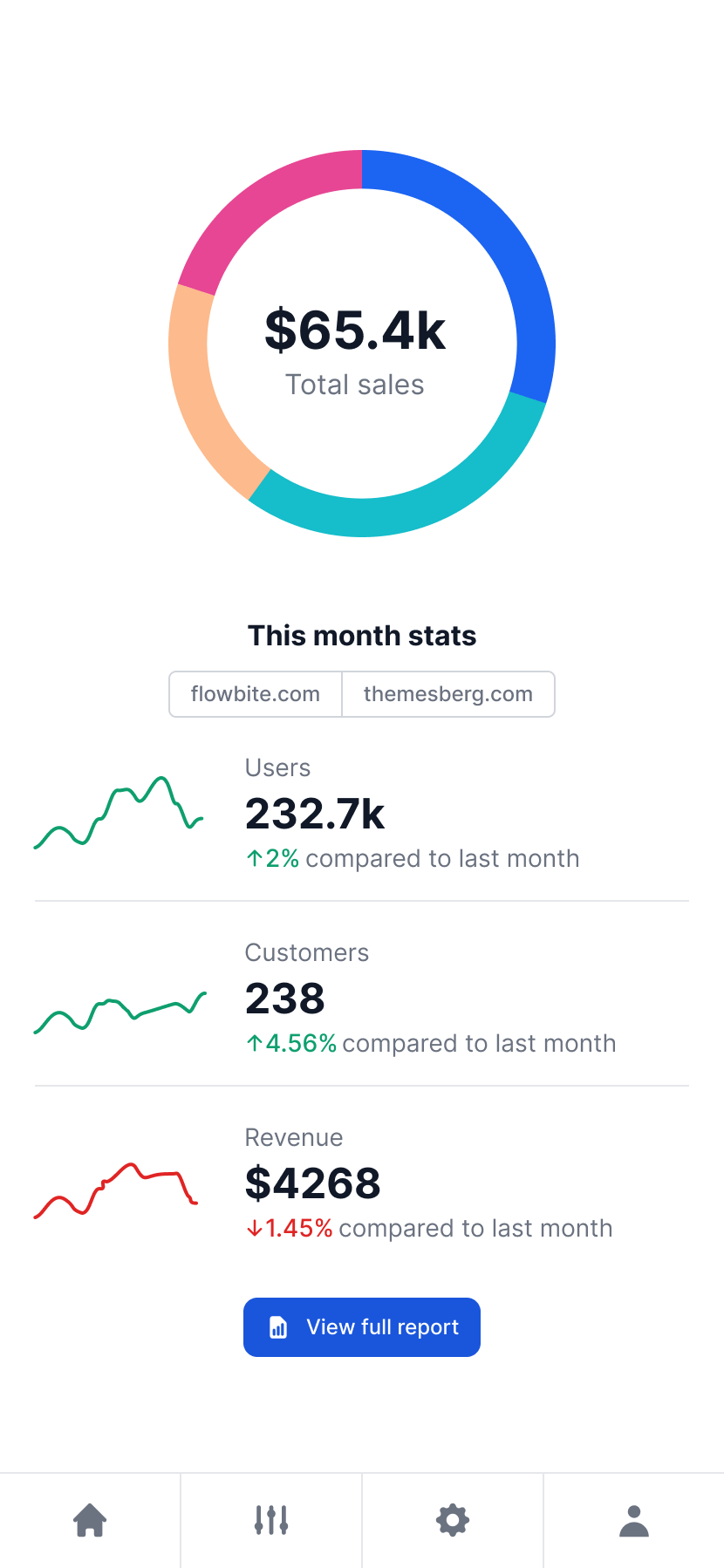
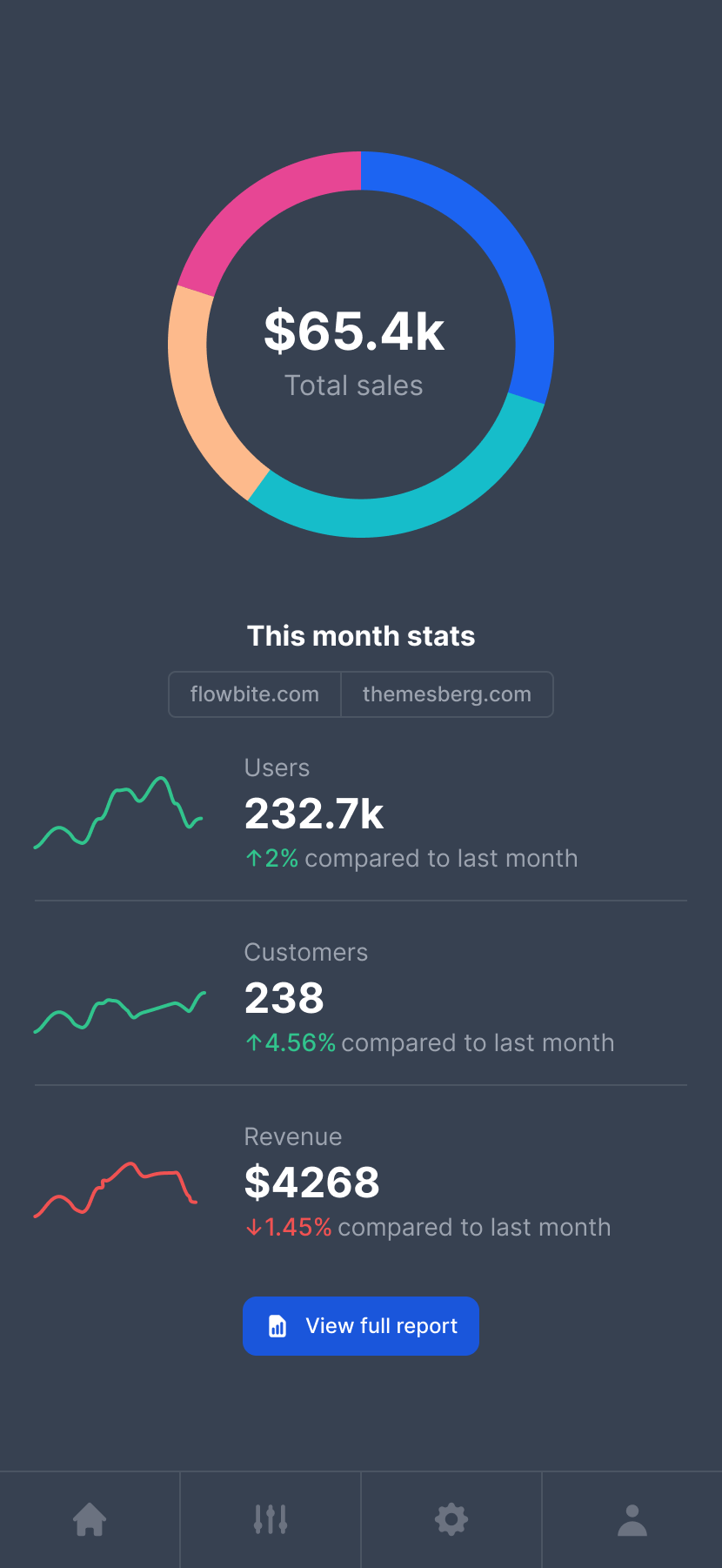
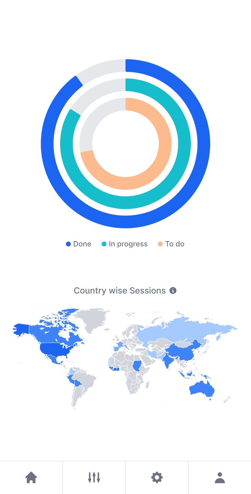
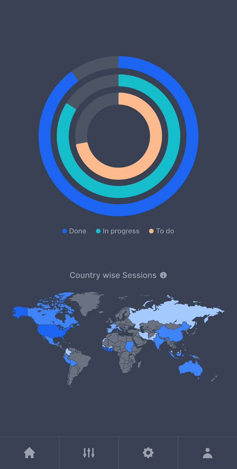

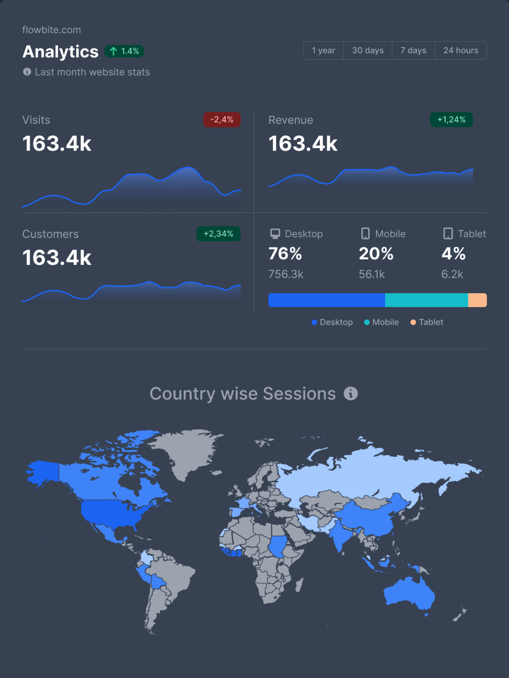
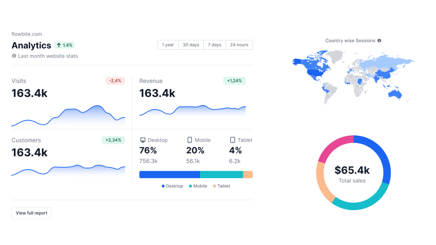


 Sale
Sale
Sale
Sale
 {/snippet}