# Svelte Popover - Flowbite


Get started with the popover component to show any type of content inside a pop-up box when hovering or clicking over a trigger element. There are multiple examples that you can choose from, such as showing more information about a user profile, company profile, password strength, and more.

Make sure that you have the Flowbite JavaScript included in your project to enable the popover interactivity by following the quickstart guide.

## Setup

```svelte
<script lang="ts">
  import { Popover } from "flowbite-svelte";
</script>
```

## Default popover

```svelte
<script lang="ts">
  import { Popover, Button } from "flowbite-svelte";
</script>

<Button>Default popover</Button>
<Popover class="w-64 text-sm font-light " title="Popover title">And here's some amazing content. It's very engaging. Right?</Popover>
```

## User profile

Use this example to show more information about a user profile when hovering over the trigger component.

```svelte
<script lang="ts">
  import { Popover, Button, Avatar } from "flowbite-svelte";
</script>

<Button>User profile</Button>
<Popover class="w-64 bg-white text-sm font-light text-gray-500 dark:border-gray-600 dark:bg-gray-800 dark:text-gray-400">
  <div class="p-3">
    <div class="mb-2 flex items-center justify-between">
      <Avatar href="/" src="/images/profile-picture-1.webp" alt="Jese Leos" />
      <Button size="xs">Follow</Button>
    </div>
    <div class="text-base leading-none font-semibold text-gray-900 dark:text-white">
      <a href="/">Jese Leos</a>
    </div>
    <div class="mb-3 text-sm font-normal">
      <a href="/" class="hover:underline">@jeseleos</a>
    </div>
    <div class="mb-4 text-sm font-light">
      Open-source contributor. Building <a href="/" class="text-primary-600 dark:text-primary-500 hover:underline">flowbite.com</a>
      .
    </div>
    <ul class="flex text-sm font-light">
      <li class="me-2">
        <a href="/" class="hover:underline">
          <span class="font-semibold text-gray-900 dark:text-white">799</span>
          <span>Following</span>
        </a>
      </li>
      <li>
        <a href="/" class="hover:underline">
          <span class="font-semibold text-gray-900 dark:text-white">3,758</span>
          <span>Followers</span>
        </a>
      </li>
    </ul>
  </div>
</Popover>
```

## Company profile

This example can be used to show more information about a company profile.

```svelte
<script lang="ts">
  import { Popover, Button, Avatar } from "flowbite-svelte";
  import { GlobeOutline, HeartSolid, ThumbsUpSolid, DotsHorizontalOutline } from "flowbite-svelte-icons";
</script>

<Button>Company profile</Button>
<Popover class="w-80 text-sm">
  <div class="flex">
    <div class="me-3 shrink-0">
      <a href="/" class="block rounded-lg bg-gray-100 p-2 dark:bg-gray-700">
        <img class="h-8 w-8 rounded-full" src="/images/flowbite-svelte-icon-logo.svg" alt="Flowbite logo" />
      </a>
    </div>
    <div>
      <p class="mb-1 text-base leading-none font-semibold text-gray-900 dark:text-white">
        <a href="/" class="hover:underline">Flowbite</a>
      </p>
      <p class="mb-3 text-sm font-normal">Tech company</p>
      <p class="mb-4 text-sm font-light">Open-source library of Tailwind CSS components and Figma design system.</p>
      <ul class="text-sm font-light">
        <li class="mb-2 flex items-center">
          <GlobeOutline class="me-2 h-3.5 w-3.5" />
          <a href="/" class="text-primary-600 dark:text-primary-500 hover:underline">https://flowbite.com/</a>
        </li>
        <li class="mb-2 flex items-start">
          <HeartSolid class="me-2 h-5 w-5" />
          <span>4,567,346 people like this including 5 of your friends</span>
        </li>
      </ul>
      <div class="ms-4 mb-3 flex">
        <Avatar src="/images/profile-picture-1.webp" stacked />
        <Avatar src="/images/profile-picture-2.webp" stacked />
        <Avatar src="/images/profile-picture-3.webp" stacked />
        <Avatar stacked href="/" class="bg-gray-700 text-white hover:bg-gray-600 dark:bg-gray-700">+3</Avatar>
      </div>
      <div class="flex">
        <Button color="alternative" class="me-2 w-full">
          <ThumbsUpSolid class="me-2" />
          Like page
        </Button>
        <Button color="alternative">
          <DotsHorizontalOutline class="h-3.5 w-3.5" />
        </Button>
      </div>
    </div>
  </div>
</Popover>
```

## Image popover

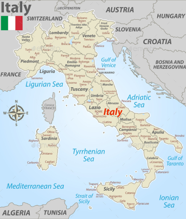
Use this example to trigger a popover component with detailed information and an image when hovering over a portion of highlighted text inspired by Wikipedia and other large news outlets.

```svelte
<script lang="ts">
  import { Popover } from "flowbite-svelte";
  import { ChevronRightOutline } from "flowbite-svelte-icons";
</script>

<p class="font-light text-gray-500 dark:text-gray-400">
  Due to its central geographic location in Southern Europe, <a href="/" class="text-primary-600 dark:text-primary-500 underline hover:no-underline" id="href_1">Italy</a>
  has historically been home to myriad peoples and cultures. In addition to the various ancient peoples dispersed throughout what is now modern-day Italy, the most predominant being the Indo-European Italic
  peoples who gave the peninsula its name, beginning from the classical era, Phoenicians and Carthaginians founded colonies mostly in insular Italy
</p>
<Popover triggeredBy="#href_1" class="w-96 text-sm font-light" classes={{ content: "p-0" }}>
  <div class="grid grid-cols-5">
    <div class="col-span-3 p-3">
      <div class="space-y-2">
        <h3 class="font-semibold text-gray-900 dark:text-white">
          About Italy
          <span>
            <p class="text-gray-500 dark:text-gray-500">
              Italy is located in the middle of the Mediterranean Sea, in Southern Europe it is also considered part of Western Europe. A unitary parliamentary republic with Rome as its capital and
              largest city.
            </p>
            <a href="/" class="text-primary-600 dark:text-primary-500 dark:hover:text-primary-600 hover:text-primary-700 flex items-center font-medium">
              Read more <ChevronRightOutline class="text-primary-600 dark:text-primary-500 ms-1.5 h-2 w-2" />
            </a>
          </span>
        </h3>
      </div>
    </div>
    <img src="/images/italy.png" class="col-span-2 h-full rounded-e-lg" alt="Italy map" />
  </div>
</Popover>
```

## Description popover

Show helpful information inside a popover when hovering over a question mark button.

```svelte
<script lang="ts">
  import { Popover } from "flowbite-svelte";
  import { QuestionCircleSolid, ChevronRightOutline } from "flowbite-svelte-icons";
</script>

<div class="flex items-center text-sm font-light text-gray-500 dark:text-gray-400">
  This is just some informational text
  <button id="b3">
    <QuestionCircleSolid class="ms-1.5 h-5 w-5" />
    <span class="sr-only">Show information</span>
  </button>
</div>
<Popover triggeredBy="#b3" class="w-72 bg-white text-sm font-light text-gray-500 dark:border-gray-600 dark:bg-gray-800 dark:text-gray-400" placement="bottom-start">
  <div class="space-y-2 p-3">
    <h3 class="font-semibold text-gray-900 dark:text-white">Activity growth - Incremental</h3>
    Report helps navigate cumulative growth of community activities. Ideally, the chart should have a growing trend.
    <span class="font-semibold text-gray-900 dark:text-white">Calculation</span>
    For each date bucket, the all-time volume of activities is calculated. This means that activities in period n contain all activities up to period n.
    <a href="/" class="text-primary-600 dark:text-primary-500 dark:hover:text-primary-600 hover:text-primary-700 flex items-center font-medium">
      Read more <ChevronRightOutline class="text-primary-600 dark:text-primary-500 ms-1.5 h-4 w-4" />
    </a>
  </div>
</Popover>
```

## Progress popover

Show a progress bar with details inside a popover when hovering over a settings button.

```svelte
<script lang="ts">
  import { Popover, Button } from "flowbite-svelte";
  import { DatabaseSolid, ChevronRightOutline } from "flowbite-svelte-icons";
</script>

<Button>
  <DatabaseSolid class="me-2 h-5 w-5 text-white dark:text-white" /> Storage status
</Button>
<Popover class="w-64 text-sm font-light">
  <div class="space-y-2">
    <h3 class="font-semibold text-gray-900 dark:text-white">Available storage</h3>
    <p class="text-gray-500 dark:text-gray-400">
      This server has <span class="font-semibold text-gray-900 dark:text-white">30</span>
      of
      <span class="font-semibold text-gray-900 dark:text-white">150 GB</span>
      of block storage remaining.
    </p>
    <div class="mb-4 h-2.5 w-full rounded-full bg-gray-200 dark:bg-gray-700">
      <div class="h-2.5 rounded-full bg-red-600" style="width: 85%"></div>
    </div>
    <a href="/" class="text-primary-600 dark:text-primary-500 dark:hover:text-primary-600 hover:text-primary-700 flex items-center font-medium">
      Upgrade now <ChevronRightOutline class="text-primary-600 dark:text-primary-500 ms-1.5 h-4 w-4" />
    </a>
  </div>
</Popover>
```

## Password strength

Dynamically show the password strength progress when creating a new password positioned relative to the input element.

```svelte
<script lang="ts">
  import { Popover, Label, Input, Checkbox, Button } from "flowbite-svelte";
  import { CheckOutline, CloseOutline } from "flowbite-svelte-icons";
  const preventDefault = <E extends Event>(fn: (event: E) => void) => {
    return function (this: any, event: E) {
      event.preventDefault();
      fn.call(this, event);
    };
  };
  const handler = () => {
    alert("Submitted!");
  };
</script>

<form onsubmit={preventDefault(handler)} class="mb-8">
  <div class="mb-6">
    <Label for="email" class="mb-2">Your email</Label>
    <Input type="email" id="email" placeholder="name@flowbite.com" />
  </div>
  <div class="mb-6">
    <Label for="password" class="mb-2">Your password</Label>
    <Input type="password" id="password" />
  </div>
  <Checkbox classes={{ div: "mb-6" }}>Remember me</Checkbox>
  <Button type="submit">Submit</Button>
</form>
<Popover class="text-sm" triggeredBy="#password" placement="bottom">
  <h3 class="font-semibold text-gray-900 dark:text-white">Must have at least 6 characters</h3>
  <div class="grid grid-cols-4 gap-2">
    <div class="h-1 bg-orange-300 dark:bg-orange-400"></div>
    <div class="h-1 bg-orange-300 dark:bg-orange-400"></div>
    <div class="h-1 bg-gray-200 dark:bg-gray-600"></div>
    <div class="h-1 bg-gray-200 dark:bg-gray-600"></div>
  </div>
  <p class="py-2">It’s better to have:</p>
  <ul>
    <li class="mb-1 flex items-center">
      <CheckOutline class="me-2 h-4 w-4 text-green-400 dark:text-green-500" />
      Upper &amp; lower case letters
    </li>
    <li class="mb-1 flex items-center">
      <CheckOutline class="me-2 h-4 w-4 text-green-400 dark:text-green-500" />
      A symbol (#$&amp;)
    </li>
    <li class="flex items-center">
      <CloseOutline class="me-2 h-4 w-4 text-gray-300 dark:text-gray-400" />A longer password (min. 12 chars.)
    </li>
  </ul>
</Popover>
```

## A11y

Use `Tab` and `Shift+Tab` to navigate between buttons or links in the popover. Press `ESC` to close it.

## Placement

Set the position of the popover component relative to the trigger element by using the `placement={top|right|bottom|left}` data attribute and its values.

```svelte
<script lang="ts">
  import { Popover, Button, type PopoverProps } from "flowbite-svelte";
  let placement = $state("bottom");

  function onbeforetoggle(ev: Event) {
    const trigger = (ev as { trigger?: { id?: string } }).trigger;
    if (trigger?.id) {
      placement = trigger.id.replace("placement-", "");
    }
  }
</script>

<Button id="placement-top">Top popover</Button>
<div class="space-x-4 rtl:space-x-reverse">
  <Button id="placement-left">Left popover</Button>
  <Button id="placement-right">Right popover</Button>
</div>
<Button id="placement-bottom">Bottom popover</Button>
<Popover triggeredBy="[id^='placement-']" placement={placement as PopoverProps["placement"]} class="w-64 text-sm font-light " title="Popover {placement}" {onbeforetoggle}>
  And here's some amazing content. It's very engaging. Right?
</Popover>
```

## Triggering

```svelte
<script lang="ts">
  import { Popover, Button } from "flowbite-svelte";
</script>

<Button id="hover">Hover popover</Button>
<Button id="click">Click popover</Button>
<Popover class="w-64 text-sm font-light " title="Popover title" triggeredBy="#hover" trigger="hover">And here's some amazing content. It's very engaging. Right?</Popover>
<Popover class="w-64 text-sm font-light " title="Popover title" triggeredBy="#click" trigger="click">And here's some amazing content. It's very engaging. Right?</Popover>
```

## Offset

Increase or decrease the default offset by adding the `offset` attribute where the value is an integer.

```svelte
<script lang="ts">
  import { Popover, Button } from "flowbite-svelte";
</script>

<Button>Default popover</Button>
<Popover offset={30} class="w-64 text-sm font-light" title="Popover title">And here's some amazing content. It's very engaging. Right?</Popover>
```

## Animation

Customize the animation of the popover component by using the transition functions from Svelte.

```svelte
<script lang="ts">
  import { Popover, Button } from "flowbite-svelte";
  import { blur, fade, slide } from "svelte/transition";
</script>

<Button>Fade popover</Button>
<Popover class="w-64 text-sm font-light" title="Popover title" transition={fade} transitionParams={{ duration: 1000 }}>And here's some amazing content. It's very engaging. Right?</Popover>
<Button>Blur popover</Button>
<Popover class="w-64 text-sm font-light" title="Popover title" transition={blur} transitionParams={{ duration: 1000 }}>And here's some amazing content. It's very engaging. Right?</Popover>
<Button>Slide popover</Button>
<Popover class="w-64 text-sm font-light" title="Popover title" transition={slide}>And here's some amazing content. It's very engaging. Right?</Popover>
```

## Disable arrow

You can also disable the popover arrow by setting `arrow` attribute to `false`.

```svelte
<script lang="ts">
  import { Popover, Button } from "flowbite-svelte";
</script>

<Button id="arrow">Default popover</Button>
<Popover arrow={false} class="w-64 text-sm font-light" title="Popover title" triggeredBy="#arrow">And here's some amazing content. It's very engaging. Right?</Popover>
```

## External reference

If you need the popover to be attached to the other element then the triggering one you can pass a CSS query to `reference` prop.

```svelte
<script lang="ts">
  import { Popover, Button } from "flowbite-svelte";
</script>

<div id="ext-ref" class="my-4 rounded-lg border border-gray-200 p-2 dark:border-gray-600">External reference</div>
<div class="space-x-4 rtl:space-x-reverse">
  <Button id="ref-1">Left</Button>
  <Button id="ref-2">Top</Button>
  <Button id="ref-3">Right</Button>
</div>
<Popover reference="#ext-ref" triggeredBy="#ref-1" class="w-64 text-sm font-light " placement="left" title="Placement: Left">And here's some amazing content. It's very engaging. Right?</Popover>
<Popover reference="#ext-ref" triggeredBy="#ref-2" class="w-64 text-sm font-light " placement="top" title="Placement: Top">And here's some amazing content. It's very engaging. Right?</Popover>
<Popover reference="#ext-ref" triggeredBy="#ref-3" class="w-64 text-sm font-light " placement="right" title="Placement: Right">And here's some amazing content. It's very engaging. Right?</Popover>
```

## Component data

### Popover

#### Types

[PopoverProps](https://github.com/themesberg/flowbite-svelte/blob/main/src/lib/types.ts#L1306)

#### Props

- title: titleSlot
- color: "default"
- trigger: "hover"
- defaultClass
- arrow: true
- children
- placement: "top"
- class: className
- classes
- isOpen: $bindable(false)


## References

- [Flowbite Popover](https://flowbite.com/docs/components/popover/)